
Alpine.js is a collection of 14 attributes, 6 properties, and 2 methods; you can think of it as jQuery for the modern web.
Introduction
Alpine.js is a light, simple, and powerful JavaScript library that is heavily inspired by Vue.js.
Alpine.js is a collection of 14 attributes, 6 properties, and 2 methods; you can think of it as jQuery for the modern web.
However, unlike jQuery — which provides imperative DOM APIs, Alpine.js provides a declarative way to bind data to the DOM using the x-bind directive.
Alpine.js is very beginner-friendly, you barely need to know any JavaScript to get up and running with it.
Like Tailwind CSS which provides a way to build great designs without leaving your HTML, Alpine.js also provides a way to make our DOM interactive without leaving our HTML.
We would be building our Image searching with these two awesome libraries.
Let’s get started with the prerequisite in the next section.
Prerequisite
- Basic knowledge of HTML and CSS
- Basic knowledge of Tailwind CSS
- Basic knowledge of Alpine.js
Getting Started
To get started, first, we will set up our server.
Follow the steps below to create the server:
- Create an npm project and install all the needed dependencies:
mkdir <!--- project name -->
cd <!-- project name -->

# create npm project
npm init -y

# install dependencies
npm i -D live-server
In this project, our only dependency is the live-server package; it is a little development server with live reload capability.
- Add our scripts:
Open the package.json file and edit the scripts section as follows:
"scripts": {
  "start": "live-server"
},
Now we can start our sever by using: npm start.
- Create application files:
In our application folder, create an index.html file
# from the application folder run
touch index.html
Add these codes to the index.html file:
<!DOCTYPE html>
<html lang="en">
  <head>
    <meta charset="UTF-8">
    <meta http-equiv="X-UA-Compatible" content="IE=edge">
    <meta name="viewport" content="width=device-width, initial-scale=1.0">
    <link href="https://unpkg.com/tailwindcss@^2/dist/tailwind.min.css"
      rel="stylesheet">

    <!-- page title -->
    <title>Image Search App</title>
  </head>

  <body>
    <!-- body starts-->
      <div class="main">
        <div class="container mx-auto px-4 sm:px-8 lg:px-16 xl:px-20">

          <!-- hero starts-->
          <section class="hero">

          </section>
          <!-- hero ends-->

           <!-- Footer starts-->
           <!-- Footer ends-->

        </div>
      </div>
    <!-- body ends-->
    <script
      src="https://cdn.jsdelivr.net/gh/alpinejs/alpine@v2.8.2/dist/alpine.min.js"
        defer>
    </script>
  </body>
</html>
In our application boilerplate above, we added both Alpine.js and Tailwind CSS using CDN. Although there are other methods for this — like using npm, CDN satisfies our current needs.
Also, in our code above we have organized our application into two main sections namely the hero section and the footer section. Both of these are wrapped by the container div and the main div — that is the div with the class container and main.
Lastly, added responsive padding to our app container to control the padding of an element at a specific breakpoint using the utility classes below:
px-4 sm:px-8 lg:px-16 xl:px-20
With these in place, we can start building our app in the next section.
Building Our Image Searching App
Fetching data and declaring initial state
In this section, we would first declare our app state and construct our Pixabay API for fetching images.
In Alpine.js, we must declare our state in the wrapper components that encapsulates all the component we want to have access to the state. So in this application, we would declare our state in the body element using the x-data directive.
The x-data directive is evaluated as a JavaScript object. And when used on a component to declare state, it provides reactive data for that component and its children.
In other to keep our code clean we would return the object for x-data from the imageGallery function — which we would create later.
To fetch images from Pixabay, we need to get an API key and construct our URL.
Pixabay has a base URL — https://pixabay.com/api/ that takes many parameters. However, in this article, we only need the following:
- Key: your API Key
- q: A URL encoded search term, not more than 100 characters. If omitted all images are returned.
- image_type: This parameter is a string used to filter results by image type. Its values include all, vector, illustration, and photo. The default value is all.
- per_page: The is an integer that determines the number of images per page. It accepts values between the range of 3 - 200. The default value is 20.
- page: The returned search results are paginated and this integer is used to set the page number.
Our constructed URL should look like this:
https://pixabay.com/api/?key=91sss65-4702ac79e2sse9aab580vfgf9b&q=food&image_type=all&per_page=36
This URL construct simply says search for all types of food images and returns 36 images per page.
We would use this URL with the x-init directive. The x-init directive enables us to hook into the initialization phase of a component. Hence we can run an expression when the component is initialized. It is used with the x-data directory to set the initial value of a component state.
Now add the following code to the body element — to declare our state, and create the imageGallery function as seen below:
...
<!-- body starts-->
<body x-data="imageGallery()"
    x-init="fetch('https://pixabay.com/api/?key=9158365-4702ac79e23be9aab580d1f9b&q=food&image_type=all&per_page=36')
      .then(response => response.json())
      .then(response => { images = response.hits })" class="bg-white">
...

  <script>
    function imageGallery() {
      return {
        images: [],
        api_key: "9158365-4702ac790p3be9aab580d1f9b",
        q: "",
        image_type: "",
        page: "",
        per_page: 200,
      }
    }
  </script>
</body>
<!-- body ends -->
...
In the code above, the x-init directive fetches data from Pixabay and stores it in the x-data directive before the component is processed. Next, we will move to create our search component in the next section.
Creating the search component
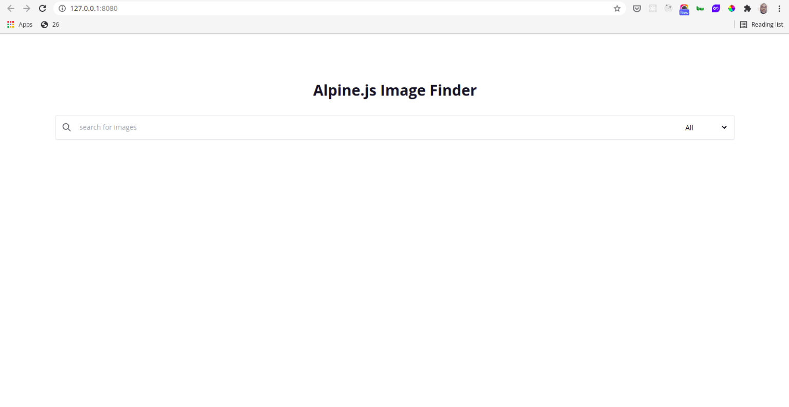
In the hero section add the add code to style the app title:
<!-- hero headline starts -->
<div class="hero-headline flex flex-col items-center justify-center pt-24 text-center">
  <h1 class=" font-bold text-3xl text-gray-900">Alpine.js Image Finder</h1>
</div>
<!-- hero headline ends -->
The code above centralizes the title across the vertical and horizontal axis using these Tailwind CSS flexbox classes:
items-center justify-center
Below the title add the following code for the search component:
<!-- image search box start -->
<section class="search pt-8">
  <div class="search-wrapper">
    <div class="search-container bg-white rounded flex items-center w-full
        p-3 shadow-sm border border-gray-200">

      <button @click="getImages()" class="outline-none focus:outline-none">
        <svg class=" w-5 text-gray-600 h-5 cursor-pointer" fill="none"
          stroke-linecap="round" stroke-linejoin="round" stroke-width="2"
          stroke="currentColor" viewBox="0 0 24 24">
          <path d="M21 21l-6-6m2-5a7 7 0 11-14 0 7 7 0 0114 0z"></path>
        </svg>
      </button>

      <input type="search" name="" id="" @keydown.enter="getImages()"
          placeholder="search for images"
        x-model="q" class="w-full pl-4 text-sm outline-none focus:outline-none
          bg-transparent">

      <div class="select">
        <select name="" id="" x-model="image_type"
          class="text-sm outline-none focus:outline-none bg-transparent">
          <option value="all" selected>All</option>
          <option value="photo">Photo</option>
          <option value="illustration">Illustration</option>
          <option value="vector">Vector</option>
        </select>
      </div>

    </div>
  </div>
</section>
<!-- image search box end -->
In the code above, our search component is a flex container with three flex items namely: the button component, the input component, and the select component. The search component is wrapped with two components, with the outer component having top padding of 2rem — from the class pt-8.
The custom button component — the search glass, uses the shorthand syntax — @click of the x-on directive to listen for click events. The x-on directive attaches an event listener to an element. In our code above, @click is equivalent to x-on:click. When the button is clicked, the getImages function is called and a new API call is made to Pixabay using the user input as parameters.
Alpine.js also, makes it easy to listen for keyboard events — such as keydown and keyup events, on specific keys. And we are listening for the Enter key event inside our input component by using the .enter modifier as seen below:
@keydown.enter="getImages()"
So when the Enter key is pressed the getImages method is called. We would create the getImages method in a moment.
The x-model directive is used in the input component to sync the value of q with the component data. Lastly, the select component uses the x-model to bind the value of the image_type to the component data.
The Tailwind utility class, outline-none is used to hide the default browser outline on focused elements throughout our search components.
Now our search component looks like this:
To create the getImages method update the imageGallery function as seen below:
function imageGallery() {
  return {
    images: [],
    api_key: "9158365-4702ac79e23be9aab580d1f9b",
    q: "",
    image_type: "",
    page: "",
    per_page: 200,
    getImages: async function () {
      const response = await fetch(
        `https://pixabay.com/api/?key=${this.api_key}&q=${this.q}&
        image_type=${this.image_type}&per_page=${this.per_page}&page=${this.page}`
      );
      const data = await response.json();
      this.images = data.hits;
    }
  };
}
The getImages method uses the same URL construct we used with the x-init directive. However, it uses the component data — user inputs as the values for the parameters. Since we can fetch data from Pixabay we can now start building our image grid.
Building the image grid
Below the code for the search component, add the following code for the image grid:
<!-- Image grid starts-->
<section id="photos" class="my-5 grid grid-cols-1 md:grid-cols-2
  lg:grid-cols-3 xl:grid-cols-4 gap-4">
  <template x-for="image in images" :key="image.id">

    <a :href="image.largeImageURL" class="hover:opacity-75 " target="_new">
      <img class="w-full h-64 object-cover" :src="image.largeImageURL"
          :alt="image.tags" />
    </a>

  </template>
</section>
<!-- Image grid ends-->
In the code above, we made our grid responsive by using the {screen}: prefix with the grid-template-columns utility to control the columns of a grid at a specific breakpoint as seen below:
<section id="photos" class="my-5 grid grid-cols-1 md:grid-cols-2
  lg:grid-cols-3 xl:grid-cols-4 gap-4">

  ...

</section>
Also, we used the x-for directive to create our image grid by iterating through the images array in the component data. The x-for directive enables us to create a new DOM element by iterating through a list. In Alpine.js, the x-for directory must be declared on a template tag that has only one root element.
Finally, we set the values of the HTML attributes — of the a and img elements by using the x-bind directive. Since the x-bind directive enables us to set HTML attributes on an element based on a JavaScript expression we can reactively bind HTML attributes as seen below:
- :href sets the image link to the value of image.largeImageURL
- :src sets the image src to the value of image.largeImageURL
- :alt sets the image alt to the value of image.tags
With the image grid built we can proceed to add the code for the footer.
The footer
To create the footer add the following code below the image grid — between the “Footer starts” and the “Footer ends” comments:
<footer class="p-5 text-sm text-gray-600 flex justify-center items-center">
  <span class="text-teal-600 font-semibold">With</span>

  <svg aria-hidden="true" focusable="false" data-prefix="fas" data-icon="heart"
    class="svg-inline--fa fa-heart fa-w-16 text-red-600 w-4 h-4 mx-2 align-middle" role="img"
    xmlns="http://www.w3.org/2000/svg" viewBox="0 0 512 512">
    <path fill="currentColor"
      d="M462.3 62.6C407.5 15.9 326 24.3 275.7 76.2L256 96.5l-19.7-20.3C186.1 24.3 104.5 15.9 49.7 62.6c-62.8 53.6-66.1 149.8-9.9 207.9l193.5 199.8c12.5 12.9 32.8 12.9 45.3 0l193.5-199.8c56.3-58.1 53-154.3-9.8-207.9z">
    </path>
  </svg>

  <span class="text-teal-600 font-semibold">From Dailydotdev </span>
</footer>
From the code above, we see that our footer is a flex container that centralizes its flex items vertically and horizontally using the following Tailwind CSS utility classes:
flex justify-center items-center
Now our final apps looks like this:
Conclusion
Alpine.js is lightweight; lighter than jQuery. At 7KB — gzipped, Apine.js gives us the reactivity and declarative nature of big frameworks such as React and Vue but at a fraction of their size.
As we have seen in this article, Alpine.js is a great way to easily add interactivity to our UI.
It has a shallow learning curve and you can pick it up with very little JavaScript knowledge.
And following this article, you should be ready to start using Alpine.js in your next project.
You can play with the code for this app on Codepen or get the full source code on Github.
Also, you can easily tryout the live version on Netlify.


