
In this article, we would be learning about Styled system; a utility first styling library that works in tandem with css-in-js libraries such as Styled-com
Introduction
Before now, many organizations relied heavily on libraries such as bootstrap and Material UI for building web interfaces.
But with the advent of improved tooling, many teams are rolling out their own design systems — Style guide and component libraries. Thus leading to the unprecedented rise in popularity of component based design system.
Component-based design system involves splitting our UI into isolated micro-components; based on a design constraint. This makes our UI more maintainable since each micro-component can easily be managed and extended.
Although, this is exciting, rolling out your own system can be very challenging.
However, libraries such as Tachynos — a functional CSS library and Styled system are very effective tools for this purpose.
In this article, we would be learning about Styled system; a utility first styling library that works in tandem with css-in-js libraries such as Styled-components or Emotion.
Let’s learn more about it in the next section.
Getting started with Styled System
Styled system is a collection of utility functions that adds styled props to our components. These styled props are synonymous to utility classes in Tailwind CSS.
Each styled function exposes a collection of styled props which are used to style our components based on values in a design system.
This enables us to work within the constraint of our design system leading to cleaner and more consistent code.
Also, out of the box, Styled system provides a rich API; that provides functions for most CSS properties. These functions provides a constrained set of props used to style our components.
However, we can create our design system as a theme object and provide it using a ThemeProvider component.
Let’s elaborate on these with some codes samples.
Note: style system requires a css-in-Js library. In this article, we are using Styled-components.
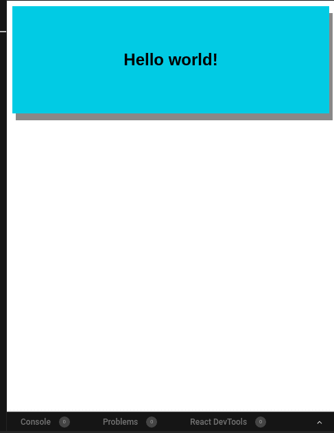
First, we create a reusable component. And add to it the needed styled functions as seen below:
import styled from "styled-components";
import { color } from "styled-system";
const Card = styled.div`
  ${color}
`;
export default Card;
In the code above we add the color utility to the Card component. This exposes the bg and color styled props to this component.
These can then be used to style the Card component as seen below:
<Card
  color={'#ffffff'}
  bg={"#1ecbe1"}
>
    <h1>Hello world!</h1>
</Card>
Styled system is simply a collection of styled props provided by different styled functions such as shown in the table below:
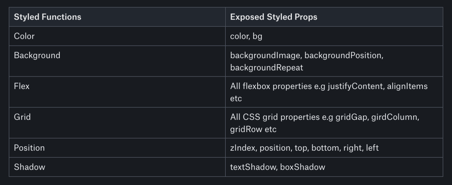
Styled Functions and Exposed Styled Props
Color
- color, bg
Background
- backgroundImage, backgroundPosition, backgroundRepeat
Flex
- All flexbox properties e.g justifyContent, alignItems etc
Grid
- All CSS grid properties e.g gridGap, girdColumn, gridRow etc
Position
- zIndex, position, top, bottom, right, left
Shadow
- textShadow, boxShadow
A complete utility list can be found in the reference table.
In Styled system a styled function exposes a specific group of styled props. Thus enabling, us to create isolated reusable micro-components. Below are some examples:
- A Shadow component:
import styled from "styled-components";
import { shadow } from "styled-system";
const Shadow = styled.div`
  ${shadow}
`;
export default Shadow;
- A Header component
import styled from "styled-components";
import { typography } from "styled-system";
const Header = styled.div`
  ${typography}
`;
export default Header;
- A Flex container
import styled from "styled-components";
import { flexbox } from "styled-system";
const Flex = styled.div`
  ${flexbox}
`;
export default Flex;
- A Grid container
import styled from "styled-components";
import { grid } from "styled-system";
const Grid = styled.div`
  ${grid}
`;
export default Grid;
Also, we can create a single powerful component by using the compose utility. This allows us to add multiply styled functions to a component.
Let’s add more styled functions to our Card component with the compose utility.
kindly consider the code below:
import styled from "styled-components";
import { compose, color, flexbox, layout, space } from "styled-system";

const Card = styled("div")(compose(flexbox, space, color, layout));

export default Card;
Now we can use it together with our Header and Shadow micro-components as seen below:
<Shadow boxShadow="5px 10px #888888">
  <Card
    display={"flex"}
    flex={"1 1 auto"}
    p={5}
    alignItems={"center"}
    justifyContent={"center"}
    bg={"#1ecbe1"}
  >
    <Header fontFamily="Helvetica" fontSize={4} fontWeight={"bold"}>
      {"Hello world!"}
    </Header>
  </Card>
</Shadow>
Building our design system:
Styled system provides a theme object shaped based on the theme specification of system-ui.
The theme object is a general-purpose format for storing design system style values and scales. And It is not coupled with the style system implementation.
Also, the styled system theme object design pattern follows the idea of scales.
Scales enables us to defined custom values for different CSS styled properties in our design constrain. Examples of scales are typographic scales, e.g font-size, line-height etc, a color object, and a spacing scale for margin and padding.
Let’s elaborate on the above with some codes samples:
const theme = {
    space: [ 4, 8, 12, 16, 32, 64, 128 ],
    fontSizes: [ 16, 18, 24, 28 ],
    fontWeights: [ 100, 200, 300, 400, 500, 600, 700, 800, 900 ],
    lineHeights: [ 1.5, 1.8, 2, 2.5 ],
    borders: ['2px solid', '4px solid', '6px solid', '8px solid', '10px solid' ],
    radii: [ 0, 2, 4, 6, 8, 10, 12, 16 ],
    colors: {
        info: '#1ecbe1',
        primary: '#1676e9',
        danger: '#e72918',
        success: '#6bc33c',
        warning: '#fff900',
        blacks: [
            'rgba(0,0,0)',
            'rgba(0,0,0,.1)',
            'rgba(0,0,0,.2)',
            'rgba(0,0,0,.25)',
            'rgba(0,0,0,.3)',
            'rgba(0,0,0,.4)',
            'rgba(0,0,0,.5)',
            'rgba(0,0,0,.6)',
            'rgba(0,0,0,.7)',
            'rgba(0,0,0,.8)',
            'rgba(0,0,0,.9)'
        ],
        whites: [
            'rgba(255,255,255,.1)',
            'rgba(255,255,255,.2)',
            'rgba(255,255,255,.3)',
            'rgba(255,255,255,.4)',
            'rgba(255,255,255,.5)',
            'rgba(255,255,255,.6)',
            'rgba(255,255,255,.7)',
            'rgba(255,255,255,.8)',
            'rgba(255,255,255,.9)'
        ]
    }
};
export default theme;
The theme object above contains different scales — as its properties.
Each scale has a key that corresponds to the CSS property they are used for. However, these keys follow a plural convention; hence, the keys: fontSizes, fontWeights, colors, borders, lineHeights, etc.
The radii key — which represents border-radius and the space key — which holds the scales for margin and padding are exceptions to this naming convention.
There are different ways to create scales but the common pattern is to use arrays for ordinal values such as the space scale — that is margin and padding and an object for colors as seen in our theme object.
We can use the values from our theme as seen below:
<Flex bg={"blacks.9"} p={4} mx={2} my={2}>
...
</Flex>
From the code above we see that styled system allows us to use bootstrap-like shorthand syntax such as p, mx, and my.
The styles above translates to this:
{
  background-color: rgba(0,0,0,.8)  // themes.colors.blacks[9]
  padding: 32px // themes.spaces[4]
  margin-left: 32px // themes.space[4]
  margin-right: 32px // themes.space[4]
  margin-top: 12px // themes.space[2]
  margin-bottom: 12px // themes.space[2]
}
Although, the style system theme object follows the key-scale naming convention, it allows us to define the organization of the scales. E.g the theme object expects a colors object. However, we decide if this colors object is flat, deeply nested, or functionally generated based on user input. In our example above the colors object contains nested arrays which enables us to specify different shades of whites and blacks.
Also, the scale-based design pattern ensures that we create a consistent styling system and provides us with a shorthand syntax for responsive styles.
To see this in action, follow the steps below to setup a demo app:
- Clone the React-stater repository by running:
git clone https://github.com/lawrenceagles/react-starter <-- your folder name -->
This react-stater app is bootstrapped using create-react-app. I have removed the unnecessary files. Also, I have added a theme.js file that contains the codes of our theme object above.
- Enter your project directory and install dependencies by running:
cd <-- your folder name -->

#Install dependencies
yarn install or npm install
- Start the dev-server by running:
yarn start or npm start
Once the dev-server starts, you can view the app at http://localhost:3000/.
- Now we can start creating micro-components. Create a components folder in the src folder and create the following files in it:
- Flex.js with the code below:
import styled from "styled-components";
import { space, color, flex } from "styled-system";
const Flex = styled.section(
  {
    boxSizing: "border-box",
    minWidth: 0
  },
  flex,
  space,
  color
);
export default Flex;
- Text.js with the code below:
import styled from "styled-components";
import { typography, color } from "styled-system";
const Text = styled.div`
  ${typography};
  ${color}
`;
export default Text;
We can now build our layout using these micro-components and apply the styles from our themes using the patterns discussed above.
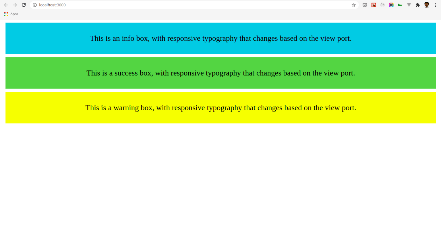
- Our App.js should look like this:
import { ThemeProvider } from "styled-components";
import theme from "./theme";
import Flex from "./components/Flex";
import Text from "./components/Text";
const App = () => {
  return (
    <ThemeProvider theme={theme}>
      <Flex bg={"info"} p={4} mx={2} my={2}>
        <Text
          textAlign="center"
          color={"blacks.0"}
          fontSize={[0, 1, 2, 3]}
          lineHeight={1}
        >
          This is an info box, with responsive typography that changes based on
          the view port.
        </Text>
      </Flex>

      <Flex bg={"success"} p={4} mx={2} my={2}>
        <Text
          textAlign="center"
          color={"blacks.0"}
          fontSize={[0, 1, 2, 3]}
          lineHeight={1}
        >
          This is a success box, with responsive typography that changes based on
          the view port.
        </Text>
      </Flex>

      <Flex bg={"warning"} p={4} mx={2} my={2}>
        <Text
          textAlign="center"
          color={"blacks.0"}
          fontSize={[0, 1, 2, 3]}
          lineHeight={1}
        >
          This is a warning box, with responsive typography that changes based on
          the view port.
        </Text>
      </Flex>
    </ThemeProvider>
  );
};
export default App;
Most of the code should look familiar. Styled system provides our theme to our micro-components by nesting them in the ThemeProvider from the css-in-js library in use — styled-components in this case.
...
<ThemeProvider theme={theme}>
  // our components
</ThemeProvider>
...
Notice the usage of our theme’s color names such as success and info as our background color.
<Flex bg={"info"} p={4} mx={2} my={2}> // bg={'info'}

<Flex bg={"success"} p={4} mx={2} my={2}> // bg={'success'}
Also, notice we specified the fontSize using responsive styles.
<Text
  textAlign="center"
  color={"blacks.0"}
  fontSize={[0, 1, 2, 3]}  // responsive styles
  lineHeight={1}
>
Instead of manually writing media queries responsive styles is a powerful way of managing responsive typography and layout.
Try resizing the browser to see the responsive typography styles in action.
Play with code or get full code from this repository.
Conclusion
We can say that styled system brings Atomic CSS to css-in-js while allowing us to create micro-components, styled using our own design system.
Also, we can write plain CSS using the CSS module and create variants for micro-components such as Buttons or Cards using the variants API.
The main package is a composition of several smaller packages which can be installed independently.
Lastly, styled system is a low-level framework-agnostic utility first styling library. Consequently, it can be used with React, Angular, or Vue.
Popular libraries such as Rebass and Theme UI are implemented with styled system thus it has a fairly huge ecosystem.
This is currently my favourite tool for building UI and a must-try for every developer.