Smoking hot Notifications for React provides lightweight, customizable and beautiful by default notifications. Learn how to use it quickly with examples.
Ding ding! A new toast shop is around your town and what a unique take to make toasts! But more importantly, to notify others of their presence!
Well, what is this new toast? How does it help developers in particular? Here’s all you need to know about the hottest new React library to make toast notifications.
About the library
React Hot Toast is a library that aims to include toast notifications in your React applications easily and intuitively.
It’s a three-step process to add the simplest of all notifications in your app. But before we even start doing anything with it, we need to take a look at some of the features it has to offer.
Here are its top 5 features:
- Easy to use: just three simple steps needed to start.
- Lots of customizations: there are many ways you can set a notification to your liking.
- Uses native Promise API: after all, everything is in JavaScript so why not use its wonderful event feature!
- Support for headless hooks: by this, you can make your custom notifications.
- Supports emojis! 🤩
Now that we have some information, here’s what the rest of the blog will tell you about:
Installation
Ready to start off making some toasts? Let’s begin by creating an empty React project from scratch. Open up your terminal and run the following commands:
npx create-react-app hot-toast-demo
cd hot-toast-demo
npm start
This will start a new React project on the current directory and will run it on your default browser window. Let’s just do the necessary things first. It’s time to install the react-hot-toast package!
On the terminal, under the same project directory, run the following command:
npm install react-hot-toast
Or, if you are using Yarn as the package manager:
yarn add react-hot-toast
Basic demo
Now that we have the library installed, we can go ahead and do some changes. We will modify the entry-level app.js file so that we have a very basic interface to kick things off.
Simply remove all the code you have on the file and then follow the below steps to have an interface similar to this:
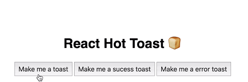
As you can see we have three buttons, the first one simply sends a toast notification with a text message, the second one is a success toast message which tells us that the action you did was successful, and the third button is just the opposite, it notifies that the action was not successful.
Okay, let’s code now.
Step 1: Build the interface
export default function App() {
 return (
   <div className="App">
     <h1>React Hot Toast 🍞</h1>
     <button onClick={notify}>Make me a toast</button>
     <button onClick={sucessNotify}>Make me a sucess toast</button>
     <button onClick={errorNotify}>Make me a error toast</button>
     <Toaster />
   </div>
 );
}
Under the default App export, we have one
heading and three buttons with their onClick handlers like notify, sucessNotify and errorNotify linked to three different functions which are defined outside the App() scope. Next, we have the component which comes from the react-hot-toast package we installed earlier. So, make sure you import the following line:
import { Toaster } from "react-hot-toast";
The notification that pops up after clicking the button comes from the Toaster component. Next, let’s add the notify logic by working on the functions.
Step 2: Add the notifications
We have three things to do here, the usual text notification, the success one, and then the error notification.
Adding the basic notification:
const notify = () => toast("Here is my toast!");
The notify function simply takes in the toast function. Inside it, we can pass any text we want to display in the notification toast. Notice we are using the arrow syntax here to write our function.
Adding the success notification:
const sucessNotify = () => toast.success("Sucess!");
The successNotify creates an animated check mark notification. For that, we need to call in the toast.success() method. Just pass in any string you want to show alongside the check icon.
Adding the error notification:
const errorNotify = () => toast.error("Error");
This creates a toast notification with an animated cross icon. Simply call the toast.error() method. Just pass in any string you want to show alongside the cross icon.
Here’s our entire code for now:
import toast, { Toaster } from "react-hot-toast";

const notify = () => toast("Here is my toast!");
const sucessNotify = () => toast.success("Sucess!");
const errorNotify = () => toast.error("Error");

export default function App() {
 return (
   <div className="App">
     <h1>React Hot Toast 🍞</h1>
     <button onClick={notify}>Make me a toast</button>
     <button onClick={sucessNotify}>Make me a sucess toast</button>
     <button onClick={errorNotify}>Make me a error toast</button>
     <Toaster />
   </div>
 );
}
Now click on each button we made and it will pop up the notification presets we added!
API references
We are about to build something more usable now. Before we do that, we first need to understand its two important APIs:
1. The toast() API
This is the most basic API from where all the toasts are made. You can call this method anywhere you like. It even works outside React. For it to work, you need to define the component first.
Apart from the three methods used in the above examples the toast() API has the following two advanced usages:
1. The Loading state: this is used when you need to define that the action done by the user is currently being processed.
toast.loading('Waiting for the action to complete...');
But using only the loading indication should be avoided as we can’t end this action, the notification will persist indefinitely causing the app to use more resources and finally, slowing it down. Instead, we can use the next alternative…
2. The Promise state: this is based on the asynchronous Promise concept of ES6. It maps the Promise to the notification used and updates automatically when the Promise is resolved or failed. You can give proper arguments as to what needs to be there in the toast for either of the cases.
 toast.promise(myPromise, {
 loading: 'Data is loading...',
 success: 'Got the data!',
 error: 'Error when fetching data :(',
});
2. The Toaster API
Here things get exciting. You can make your own notifications from this API. You can render any component you want, all Toaster does is that it provides the notification’s current state.
Here’s an example:
const buildNotification = () => {
 const { myToasts } = useToaster();

 return (
   <div>
     {myToasts.map((toast) => (
       <div>{toast.message}</div>
     ))}
   </div>
 );
};

toast('Hey toast!');
A practical example
Let’s make a more practical example with this library. Here’s what we are trying to achieve:
As you can see in the embed above, this is a chat-like interface where you can type your message in the input and hit the “Send a hot toast 🍞 ” button to get a customized toast notification. Moreover, if you try to send toast several times, you see the notification which came earlier goes away first with a transition, and if you start hovering the cursor over any of these elements, the notification stays there, just like we have on our systems! It goes away when you stop hovering.
Note that the input box does nothing but shows you a practical scenario where we can use this library. We have a lot to explore here, so let’s get to code.
Step 1: Code the interface
There are three UI elements here:
- The input field
- The button
- The notification itself
return (
   <div className="App">
     <HotToastNotifications />
     <input placeholder="Write your toast here..." />
     <button onClick={() => toast("🛎 Toast message sent!")}>
       Send a hot toast 🍞
     </button>
   </div>
 );
On the onClick of the button we need to fire the toast() method wherein we add the string needed to show on the notification. Here it says, "🛎 Toast message sent!". We render the notification component named HotToastNotifications beforehand.
Next, let’s make something unique. Here, we will be using the useToaster() headless API to make our custom component from scratch.
Step 2: Create handlers and the notification component
const { toasts, handlers } = useToaster();
In the HotToastNotifications component, we first define the two handlers for useToaster() i.e. toasts and handlers. The first one will be used to map over the number of notifications to render and the latter is to add the hover-based handling.
toasts.map((toast) => {
       const offset = calculateOffset(toast.id, {
         reverseOrder: false,
         margin: 10
       });
Using JavaScript’s native map() method, we loop over each individual toast element, calculating its offset position defined on the calculateOffset handler of useToaster API. In this, we need to pass the toastId which is a unique identifier for each toast, the reverseOrder which is a boolean property to state whether notifications appear in reverse order or not, and the margin between each notification when they appear together.
Step 3: Create a custom shape of the component
const ref = (el) => {
         if (el && !toast.height) {
           const height = el.getBoundingClientRect().height;
           updateHeight(toast.id, height);
         }
       };
Next, to make the shape of the custom notification, we are using the getBoundingClientRect() method on the element which returns DOMRect object to get the precise size of the height of the element. Then with the updateHeight handler, we set it to the toast’s ID and the calculated height.
Step 4: Style the notification
return (
         <div
 role="alert"
           aria-label="notification"
           key={toast.id}
           ref={ref}
           style={{
             position: "absolute",
             width: "13rem",
             padding: "0.7rem",
             background: "rgba(175, 75, 62, 0.1)",
             borderRadius: "3rem",
             transition: "all 0.2s",
             transform: `translateY(${offset}px)`,
             opacity: toast.visible ? 1 : 0
           }}
         >
           {toast.message}
         </div>
       );
Time to add some styles to the custom notification we just made! You can choose any HTML element to make them but usually
Step 5: Create the hover based interactions
Finally, we have one last thing left. We want that until we hover the notification, it shouldn’t go away. It can go when we remove hovering.
<div
     style={{
       position: "fixed",
       top: 10,
       left: 10
     }}
     onMouseEnter={startPause}
     onMouseLeave={endPause}
   >
To make this possible we make the same
And that’s it! If you implement all the code above you can now play with your own custom toast notification sent whenever the onClick event is triggered! Here’s the entire code of the custom notification component we made:
const HotToastNotifications = () => {
 const { toasts, handlers } = useToaster();
 const { startPause, endPause, calculateOffset, updateHeight } = handlers;
 return (
   <div
     style={{
       position: "fixed",
       top: 10,
       left: 10
     }}
     onMouseEnter={startPause}
     onMouseLeave={endPause}
   >
     {toasts.map((toast) => {
       const offset = calculateOffset(toast.id, {
         reverseOrder: false,
         margin: 10
       });
       const ref = (el) => {
         if (el && !toast.height) {
           const height = el.getBoundingClientRect().height;
           updateHeight(toast.id, height);
         }
       };
       return (
         <div
           key={toast.id}
           ref={ref}
           style={{
             position: "absolute",
             width: "13rem",
             padding: ".7rem",
             background: "rgba(175, 75, 62, 0.1)",
             borderRadius: "3rem",
             transition: "all 0.2s",
             transform: `translateY(${offset}px)`,
             opacity: toast.visible ? 1 : 0
           }}
         >
           {toast.message}
         </div>
       );
     })}
   </div>
 );
};
Conclusion
Wasn’t it that easy! I mean, the ability to use hooks to make a custom notification is so mind-blowing and that comes with such ease to make. Let me know how you will be using this library, you can surely open a new issue to its GitHub and let the library author know of any bugs you encountered or a new feature to include!