
In this article, you will get to know a lot. Starting from installing Tailwind for your project, adding cool hover, focus, and other interactions, to getting to know how responsive elements work in a Tailwind project, converting a non-responsive section to be mobile responsive.
Here we are on the third article of the Tailwind CSS series. I hope you are enjoying it. This time around though, we will take the entire process a notch up by caring more about different screen sizes, doing a bit of clean-up of our HTML code with the help of some utilities of our own, and adding common interactions to the hero section of the webpage. As always there will be plenty of explanations and code examples along the way. The best part is we will be using the demo used in the previous article to make all things happen.
Let’s take a quick look at how this article is structured:
- Installing Tailwind CSS like a pro
- Adding interactions
- A note of Tailwind responsiveness
- Converting our demo to responsive code
- Custom utility classes
- Conclusion
- What’s next?
Who’s ready to take a step up in the world of Tailwind? Let’s go!
Installing Tailwind CSS like a pro
Till now we have been simply importing a tag in our HTML file so that it fetches the Tailwind code from the CDN. It’s good to quickly spin up a new project for small demos or where you don’t want any manual controls over the library. But if you truly need to unlock the full power of what this CSS framework can do, going pro is the way.
But what does it bring to the table?
Installing Tailwind via the NPM command in your new or existing project has many benefits, including:
- It lets you customize Tailwind’s default theme.
- If you need, you can install third-party plugins to supercharge your workflow.
- You can use different directives like @apply, @variants.
- You can unlock additional variants whenever you need to.
- And from the performance point of view, you are able to use PostCSS so that your builds are faster. Learn more on how PostCSS preprocessor helps Tailwind here.
Okay then, it’s time to fire up your Terminal and add Tailwind to your project.
Install Tailwind with PostCSS
Navigate to your project directory and run the following command:
npm install -D tailwindcss@latest postcss@latest autoprefixer@latest
This will install the framework, PostCSS, and Autoprefixer a tool which PostCSS itself uses under-the-hood.
Head over to the package.json file in your code editor and you should see the following new packages:
// package.json
"devDependencies": {
   "autoprefixer": "^10.2.5",
   "postcss": "^8.2.8",
   "tailwindcss": "^2.0.4",
 }
Add Tailwind as a PostCSS plugin
Now that our dependencies are installed, we just need one more step before we can start writing some markup code.
At the root of your project, add two new files; first the postcss.config.js file which is just a single export JavaScript object that will instruct to run Tailwind first and then take its code and run Autoprefixer tool over it.
// postcss.config.js
module.exports = {
 plugins: {
   tailwindcss: {},
   autoprefixer: {},
 },
}
The second file can be created using the following command:
npx tailwindcss init
Running this command creates a new JS file called tailwind.config.js. This configuration file is used to customize the default theme and properties of Tailwind in whichever way you like from custom fonts, colors, line spacing, etc.
// tailwind.config.js
module.exports = {
  purge: [],
  darkMode: false, // or 'media' or 'class'
  theme: {
    extend: {},
  },
  variants: {},
  plugins: [],
}
The Tailwind config file comes really handy in most of the projects and we will make its full use later.
Add Tailwind in your CSS
This is important and works like a CSS preprocessor. If you haven’t already, create a new folder and inside it a CSS file named styles.css that will hold the common directives for the base styles, components, and utilities:
/* ./your-css-folder/styles.css */
@tailwind base;
@tailwind components;
@tailwind utilities;
And that’s all you need to do to install Tailwind like a pro with NPM. Now that you have unlocked most of its features, it’s time to use them!
Adding interactions
We are about to make a big UX improvement on our part of the already coded hero section from the previous article.
Here’s how it currently looks:

It looks good but what about interactions! Here’s how it will be afterward:
Try to interact with the above embed. Make sure you hover the buttons and the image. Next, you can also click and hold on the buttons to see the ‘active’ state and also try to navigate around with the keyboard tabbing through the elements so that the ‘focus’ state is unlocked.
Now let’s learn how to achieve this. All the hover, focus, and more states (like active, visited, disabled, etc) of an HTML element can be achieved by adding a prefix utility with an appropriate state variant.
The hover interaction
While hovering, we need our two buttons to lift up, increase their shadows, and change the background color. For this, we use the hover: to only apply a specific utility on the hover.
Hence, to add a hover state in an element like button, we simply add the following:
css
… hover:bg-green-800
This will apply the following CSS property to that button element:
background-color: rgba(6, 95, 70, 1);
So what we need to do is just add the hover: prefix before the new utility class style we want to add. Let’s make the shadow of the buttons a bit better with the shadow-lg class and lift it up with the -translate-y-1 which adds a translate-y: -0.25rem; property.
But as soon as you add a translate class, it works but the transition isn’t there yet. The ‘lift-up’ interaction we want to achieve can be made smooth with the help of the transition and transform utility classes (be sure to add the transform class along with the actual ‘transform’ transition you want to achieve). Here’s how our new classes look like:
hover:bg-green-800 hover:shadow-lg transform transition hover:-translate-y-1
For the image to the right, we just need it to have a larger shadow and a bit high ‘lift-up’ effect. Here’s how it look in Tailwind code:
hover:shadow-lg transform transition hover:-translate-y-2
The focus interaction
Now let’s handle the interaction which activates when you either click and hold the mouse cursor or navigate through the tab key. While on focus, we usually get a browser-default outline. On Chrome, it looks like this:
Of course, this does not look good. Time to make it look consistent like this:

For this, a new focus: prefix is used. All the other concepts from the hover: remain the same for this and any other state interactions.
We want the color to change from bg-green-700 to bg-green-800, remove the default browser outline with outline-none, add a new outline with box-shadow (called a ‘ring’ that is the same green color and is a bit offset with the actual button element.
All in all, here’s what we get:
focus:ring-2 focus:ring-green-600 ring-offset-2 outline-none focus:bg-green-800 focus:shadow-lg
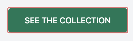
That’s all with the interactions, after all the code, your code should look like this:
.
.
.
<a class="flex items-center justify-center px-8 py-3 font-medium
 rounded-md text-white bg-green-700 shadow uppercase hover:bg-green-800
 hover:shadow-lg transform transition hover:-translate-y-1 focus:ring-2
 focus:ring-green-600 ring-offset-2 outline-none focus:bg-green-800
 focus:shadow-lg active:bg-green-900" href="#">See the collection</a>

<a class="flex items-center justify-center px-8 py-3 ml-4 font-medium
 rounded-md text-green-700 bg-white shadow uppercase hover:shadow-lg
 transform transition hover:-translate-y-1 focus:ring-2
 focus:ring-green-600 ring-offset-2 outline-none focus:shadow-lg" href="#">Learn more</a>
.
.
.
<img class="object-cover object-center w-96 rounded-md hover:shadow-lg
 transform transition hover:-translate-y-2"
 src="https://images.pexels.com/photos/3952029/pexels-photo-3952029.jpeg"
 alt="Image of plants" />
.
.
.
A note on Tailwind responsive design
As with all other CSS frameworks, Tailwind also has its soft heart towards responsive design to make adaptive interfaces feasible. One of the best things? You can conditionally add responsive code changes to each HTML element. No more adding those @media screen media query codes in a separate CSS file.
With such power, you can literally change any element at any given breakpoint you want.
Tailwind allows the following five prefixes for common breakpoints by default:
- sm: min-width of 640px.
- md: min-width of 768px.
- lg: min-width of 1024px.
- xl: min-width of 1280px.
- 2xl: min-width of 1536px.
And of course, you can easily change the default breakpoint values according to the need and add more.
Okay, so how to use these new responsive utilities? Let’s say if you want to change an element’s width from w-20 (5rem) to w-10 (2.5rem) on small and maybe w-40 on the large breakpoint. You would do this:
<input class="w-10 md:w-20 lg:w-40" />
This will take w-10 on small devices as the Tailwind’s media queries are min-width, w-20 on tablet (md) and large screens (lg) , and w-40 on large and above resolutions.
Converting our demo to responsive code
Now let’s be real and make our coded hero section responsive to different device sizes.
Here’s what it should look like at the end. Try to open the following embed in a new window and resize your browser.
As you can see, all of the elements are now stacked one after another instead of being side-by-side. This happens from devices with a minimum width of 640px (phones) to a tablet-sized screen of 768px. Just when the width becomes larger than 768px, it goes back to the flex layout we had before.
Of course, this is not targeted to all the remaining resolutions like below 640px or above 1024px, but here, we will get to know how to make each element responsive. A similar approach can be followed with some adjustment of values while making it responsive for other breakpoints not covered here.
Here’s our code from the previous demo:
<body class="bg-gray-100">
   <div class="m-16 flex justify-center items-center" role="main">
     <div class="px-16">
       <p class="h-10">🪴 Plant-a-holic</p>
       <hr class="w-3/5" />
       <h1
         class="mt-6 text-5xl font-headline tracking-tight font-extrabold text-gray-900 leading-snug"
         role="heading"
         aria-level="1"
       >
         We got your plants. <br />
         <span class="text-green-700" role="heading" aria-level="1"
           >And we deliver them for you.</span
         >
       </h1>
       <p class="w-3/5 mt-2 text-gray-600 text-lg" aria-level="2">
         Our hand-picked collection of plants gives you all the natural wonders
         you ever wanted in your room, living space or even kitchen.
       </p>
       <div class="mt-8 flex" aria-level="3" role="button">
         <a
           class="flex items-center justify-center px-8 py-3 font-medium rounded-md text-white bg-green-700 shadow uppercase"
           href="#"
           >See the collection</a
         >
         <a
           class="flex items-center justify-center px-8 py-3 ml-4 font-medium rounded-md text-green-700 bg-white shadow uppercase"
           href="#"
           >Learn more</a
         >
       </div>
     </div>
     <div class="mr-40" role="img">
       <img
         class="object-cover object-center w-96 rounded-md"
         src="https://images.pexels.com/photos/3952029/pexels-photo-3952029.jpeg"
         alt="Image of plants"
       />
     </div>
   </div>
 </body>
Let’s begin with the outermost div which holds all the elements.
Step 1: Fix the overall layout: by default, if you don’t specifically provide a display property, Tailwind adds a block level layout. We need to add lg:flex to the outermost container so that the display: flex is only added when the device width is equal to or greater than 1024px.
But when you go back to the usual screen size, the layout won’t be in flex now, it will still be a block-level element. To fix this, simply add lg: prefix in front of any change you want to do in the 1024px and above layout. Hence we need to apply lg:flex, lg:text-left and lg:m-16.
By now here is how our new changes look like:
lg:flex lg:m-16 text-center lg:text-left justify-center items-center
Step 2: Style the text and buttons: on the div containing our heading, paragraph, and buttons, we move from px-16 to p-16 so that we get 4rem padding on all four sides.
The horizontal rule which we shrank to 60% before, can now be given its full 100% width value with the w-full utility.
For the h1 heading, we move from text-5xl class to text-4xl. The paragraph is also given the font-size of 1rem thanks to the text-base class name.
Now for the two buttons we have, currently they are in flex mode. Let’s change them to flex only when we move from the breakpoint of 1024px and above i.e. lg:flex, add the auto margin in small resolutions, and restrict the width to half of its size (w-1/2 i.e. width: 50%). But now the second button is sticking close to the first one!
To fix this, we can use the sm:mt-2.5 utility class to add some top margin value, say .625rem just a little bit.
With all of this done, you will get the following output:

Step 3: Resize the image: just like we had some left and right padding for the div which contained the text and buttons, here also we need the same on the x-axis, so naturally, we have sm:px-48 which adds 12rem of padding on both sides.
And just like that, you made the layout responsive for mobile screens! Give yourself a pat on the back, review the following code we wrote till now and when you are ready, follow on to the last section.
<body class="bg-gray-100">
   <div
     class="lg:flex lg:m-16 text-center lg:text-left justify-center items-center" role="main"
>
     <div class="px-16 sm:py-16">
       <p class="h-10">🪴 Plant-a-holic</p>
       <hr class="w-3/5 sm:w-full" />
       <h1
         class="mt-6 lg:text-5xl sm:text-4xl font-headline tracking-tight font-extrabold text-gray-900 leading-snug sm:leading-normal"
         role="heading"
         aria-level="1"
       >
         We got your plants. <br />
         <span class="text-green-700" role="heading" aria-level="1"
           >And we deliver them for you.</span
         >
       </h1>
       <p
         class="lg:w-3/5 sm:w-full mt-2 text-gray-600 lg:text-lg sm:text-base"
         aria-level="2"
       >
         Our hand-picked collection of plants gives you all the natural wonders
         you ever wanted in your room, living space or even kitchen.
       </p>
       <div
         class="mt-8 lg:flex sm:block sm:w-1/2 sm:mx-auto lg:mx-0"
         aria-level="3"
         role="button"
       >
         <a
           class="flex items-center justify-center px-8 py-3 font-medium rounded-md text-white bg-green-700 shadow uppercase hover:bg-green-800 hover:shadow-lg transform transition hover:-translate-y-1 focus:ring-2 focus:ring-green-600 ring-offset-2 outline-none focus:bg-green-800 focus:shadow-lg active:bg-green-900"
           href="#"
           >See the collection</a
         >
         <a
           class="flex items-center justify-center px-8 py-3 lg:ml-4 sm:ml-0 sm:mt-2.5 lg:mt-0 font-medium rounded-md text-green-700 bg-white shadow uppercase hover:shadow-lg transform transition hover:-translate-y-1 focus:ring-2 focus:ring-green-600 ring-offset-2 outline-none focus:shadow-lg"
           href="#"
           >Learn more</a
         >
       </div>
     </div>
     <div class="lg:mr-40 sm:mr-0 sm:px-48 lg:px-0" role="img">
       <img
         class="object-cover object-center lg:w-96 rounded-md hover:shadow-lg transform transition hover:-translate-y-2"
         src="https://images.pexels.com/photos/3952029/pexels-photo-3952029.jpeg"
         alt="Image of plants"
       />
     </div>
   </div>
 </body>
Custom utility classes
Now all of the default Tailwind utilities are well and good but sometimes our design is such that we need some more customized versions of these classes. In such cases, we need to develop some custom utilities. Tailwind being so flexible allows you to add your own styles and add to specific elements you like.
To start adding a new custom utility head over to your tailwind.css file. After the @tailwind utilities directive, you can start adding custom CSS styles below this line with the @tailwind utilities keyword.
Here’s an example:
/* tailwind.css */
@tailwind base;
@tailwind components;
@tailwind utilities;

@layer utilities {

  /* Always show scrollbars */
   .show-scroll {
     overflow: scroll;
  }

   /* Automatically calculate column count */
   .col-auto {
     column-count: auto;
  }

   /* Change writing mode to vertical top to bottom flow */
   .write-v-rl {
     writing-mode: vertical-rl;
  }
}
In this example, we defined three new custom utilities. The @layer directive is used to move all the styles written under it to the usual @tailwind utilities so that there are not any specificity issues. Next, we simply need to define a suitable utility class name that holds the actual CSS code.
Now we can hop back to the index.html file to apply these new classes:
.
.
.
<span class=”show-scroll”>This span will always have a scroll bar</span>
.
.
.
<p class="col-auto">This is a bunch of text split into columns using the CSS `column-count` property. The text is equally distributed over the columns.</p>
.
.
.
<tr>
   <td class=”write-v-rl”>Vertical top to bottom</td>
   <td>First</td>
   <td>Second</td>
   <td>Third</td>
   <td>Fourth</td>
</tr>
All cool but what about responsive variants here? What if I want to add one of these to a specific breakpoint? Fortunately, Tailwind got this covered. Based on the different breakpoints defined in the tailwind.config.js file, you can simply wrap your custom utilities in the @variants responsive directive.
Here’s an example:
/* tailwind.css */
@tailwind base;
@tailwind components;
@tailwind utilities;

@layer utilities {
  @variants responsive {
  .col-auto {
    column-count: auto;
  }

  .col-2 {
    column-count: 2;
  }

  .col-4 {
    column-count: 4;
  }
}
Then use this as:
.
.
.
<p class="col-auto md:col-2 lg:col-4">This is a bunch of text split into
 columns using the CSS `column-count` property. The text is equally
 distributed over the columns.</p>
.
.
.
Conclusion
In this article, you got to know a lot starting from installing Tailwind for your project, adding cool hover, focus, and other interactions, to getting to know how responsive elements work in a Tailwind project, converting a non-responsive section to be mobile responsive.
At last, we had a close look at creating our own custom utilities, using directives, adding them to responsive elements all with the help of examples in between.
What’s next?
In the fourth part of the Tailwind CSS from Zero to Hero series, we take a giant leap forward in learning this framework by introducing components - quite a lifesaver when you have a huge codebase.
And when we are done with that, we will go full bloom by preparing our code for production - heavily needed so that we don’t compromise with the performance of our project.