
Welcome to the complete Tailwind CSS guide you need to build high-quality frontend webpages.
Welcome to the complete Tailwind CSS guide you need to build high-quality frontend webpages. In this entire series of articles, we will be covering every single topic needed in order to master the complete workflow of Tailwind.
Starting from absolutely nothing you will get to know all about it, including why you should use it, what features does it offer and what are the benefits over other frameworks.
And don’t worry there will be examples, clear explanations, and details you need to know about each topic covered. Not only that, we will be focussing on some lesser-known features which are useful for real-life applications.
So who is ready to dive into the world of Tailwind? Let’s start with the most common question you might have now.
What is Tailwind CSS?
Tailwind is a utility-first CSS framework that lets you add styles to your web pages without writing a single line of custom CSS code.
Let’s dissect the two important things I wrote above:
- _‘Utility-first’_ means that instead of regular and old-fashioned framework classes, it works on low-level utilities which are essential to style any HTML element you wish. These may include styles like `padding`, `display`, `width`, `height` etc.
- _‘Without writing a single line of custom CSS code’_ means that well...you are getting rid of those long CSS code blocks you need to write just to style one element according to the design provided to you. Tailwind handles this all.
So instead of pre-built components, it provides utility classes. That’s what makes it different from others. Adam Wathan, the creator of Tailwind, writes how a utility class is approached in this article.
But why Tailwind?
I get it. There are many CSS frameworks and libraries like Bootstrap, Bulma, Foundation, etc. which are really popular and used widely. You might feel, “Why do I need to learn about yet another CSS framework? What’s the use? How will it benefit me?” And my answer is, “While it may not be the perfect solution to your style needs, it does have the following features that you should reflect on and try…”:
- You use only what you need: most of its competitors give you too many unnecessary classes, straight at your face. That becomes a lot to digest especially when you are working on some large-scale projects. With Tailwind you choose what styles you need to apply, code it and there it reflects immediately.
- You don’t need to code custom CSS: well, in most cases you don’t need to override base classes. Until you have a very complex design system with tons of the custom element, you will be using the in-built styles provided by this framework as it always gives you low-level utility classes.
- It even removes the not-used CSS code! Thanks to PurgeCSS (we will talk about this next), when you run its commands, it will automatically remove every CSS code we aren’t using in our project. The output of the final bundle we get is clean without any heavy load, thereby improving CSS load time and thus the overall load time of the page.
- Really easy to customize, if you like: of course, there are times when what’s provided isn’t enough. You are free to change its config file, add your own mix, and deliver on what your design lead said! It’s just a matter of adding some objects to its JSON file and there you have it!
- Built-in responsive classes: no need to write those tricky media queries. With Tailwind, you plug in the responsive powers directly in your HTML. Everything changes magically once you have applied the breakpoints.
- Awesome auto-complete support: if you are working on the popular VS Code tool to write code, you can install the Tailwind CSS IntelliSense extension which provides you autocomplete suggestions, linting, class definitions, etc. So if you forget what padding size to apply, just start typing and see the difference.
- Support for dark mode, new CSS features like Grids, and even their own component library. Need I say more?
The PurgeCSS Effect
Tailwind CSS is blessed with Purge. PurgeCSS is a tool to remove unused CSS from your CSS file. You can easily integrate it with your Tailwind project.
While optimizing for production (more about production in Part 4 of this series), when you use Purge, it will check for all of the unused classes in your HTML code. You just add any file extension that includes a markup code like .html, .jsx, .vue, etc. to the config object and run the Purge command. Then you can see your output build files are much optimized and use only the classes they need.
Don’t worry, we will get to know all about this towards the end of the article series.
Now you know what all it has to offer and why it just might be the next CSS framework for your web app.
Part 1 of this article series will cover how to get started with Tailwind and make a quick webpage section. Just the barebones you need to have the confidence in writing the code.
Here’s a quick rundown of the entire process we will go through:
- Installation
- Basic concepts
- Browser support
- A quick demo
- Conclusion
- What’s next?
Installation
Pssst...wait. I have to tell you that there is no such thing as running some npm commands for now. We will be scratching only the upper layer of simply pulling the CDN for the current demo. The main goal right now is not to start with a heavy workflow but to understand the basic concepts.
With that, you can open up your index.html file, write the initial HTML code and then add the following:
<link href="https://unpkg.com/tailwindcss@^2/dist/tailwind.min.css" rel="stylesheet">
This pulls in the latest configuration build via CDN so that you can use the base classes on the go.
Okay, looks like this really quick installation is done! Can we move on with what we are about to build? Not yet. First, let’s clear out some basic concepts.
Basic concepts
Tailwind comes with a good amount of utility classes that you should know. Let’s take a look at the most common ones with an example.
If you were to make this small box which is aligned to the center of the webpage you will need to write the following CSS (the exact numbers will vary):
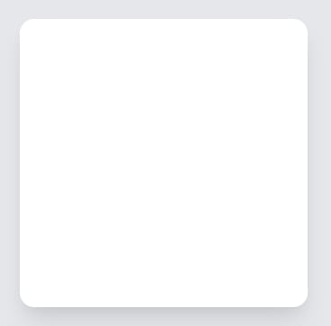
div {
  width: 200px;
  height: 200px;
  display: block;
  background: white;
  border-radius: .5rem;
  box-shadow: 3px 0px 14px -1px rgba(0,0,0,0.16);
  margin: 0 auto;
}
But the same style can be done with Tailwind CSS as:
<div class="min-h-screen bg-gray-200 flex flex-col justify-center">
    <div class="sm:mx-auto">
        <div class="bg-white shadow-lg p-20 rounded-lg" />
    </div>
</div>
At first glance this might be a bit uneasy for you to comprehend what is written but allow me to explain each entity here:
- There are three div elements we need to create that element from scratch. The first one provides the whole container a minimum height of 100vh so that now we can use the power of Flexbox to align the entire element to the center of the screen.
- The second div has some responsive alignment class which can be realized when you change the width of the viewport (see the live demo link to this code below).
- Finally, we have the actual square element with all the style properties.
Let’s now understand what utility classes are being used.
- min-h-screen: this equals min-height: 100vh; in CSS.
- bg-gray-200: this gives the webpage body element a background color of light gray or rgba(229, 231, 235, 1) to be specific.
- flex flex-col justify-center: these are all the Flexbox styles. It tells Tailwind to use display: flex; use flex-direction like column and then justify the content to center.
- sm:mx-auto: every time you see a prefix applied to a Tailwind property, you can be sure that it’s either using a responsive design feature or some state prefixes like hover, focus, and other states. Here on the small viewports, we want the horizontal margin (i.e. left and right margins) of our container to be auto.
- bg-white shadow-lg p-20 rounded-lg: all of these corresponds to how the box we made actually ‘looks’. Starting from making its color white to adding a large shadow, adding padding of 5rem, and then rounding off the corners.
Now from where I got to know that p-20 equals padding: 5rem;? Well, all of these are very well documented on their official documentation. It's good to know that Tailwind sizes are based on the multiplications of 0.25rem units.
If you like then you can try to play with this code I wrote above here.
Browser support
It is really important to know which browsers Tailwind supports and how to manage vendor prefixes if any so that a wide array of browsers and systems are supported.
As of the time of writing this article, Tailwind CSS supports the latest stable versions of Chrome, Firefox, Edge, and Safari. But if you are the old IE guy and need support for that (in any case) then the latest (v2.0) version of Tailwind isn’t for you. You have to downgrade to v.1.9 for that.
For those who are not using the Tailwind CLI tool (which adds all the vendor prefixes automatically), you can use Autoprefixer.
A quick demo
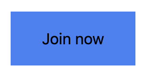
Time to put some things into practice as we make the following button with Tailwind CSS. Let’s try making this one.

- Padding: first, we use the HTML element, add the label and give it proper padding values. Now, this might be something different from what we usually do in proper CSS. No need to add custom height and width values or use display: block; We are simply using the padding values both on the x and y axes.
The button is rectangular and thus we can give it more x padding value than y. In the language of Tailwind, it is px-8 py-4 respectively.
px-8 equals padding-left: 2rem; padding-right: 2rem;
py-4 equals padding-top: 1rem; padding-bottom: 1rem;
<button class="py-4 px-8">Join now</button>
- Background: this button has a blue background and Tailwind comes with a lot of different color shades for one prominent color. For us bg-blue-500 suits as it gives us the 500 color shade of the blue color. Here is the entire list of background colors to choose from.
The higher the shade number, the darker the color gets and vice-versa.
bg-blue-500 equals background-color: rgba(99, 102, 241, 1);
OUTPUT:
- Rounded corners: here we can either use rounded-xl or rounded-lg classes which simply means ‘extra-large rounded corners’ or ‘large rounded corners’. The first one fits well and thus xl seems a good choice.
rounded-xl equals border-radius: 0.75rem;
<button class="py-4 px-8 bg-blue-500 rounded-xl">Join now</button>
OUTPUT:
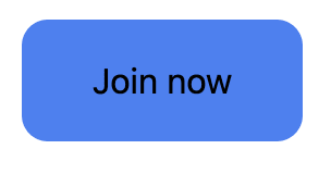
- Text color, transform, and weight: the black text on a blue background calls for contrast issues. So we have to change it to white. For text colors, you can simply say text-white. As for making it uppercase, it’s simply the uppercase utility class. Easy!
The font-weight is not the regular one or full-blown bold. Hence font-semibold is the way to go!
text-white equals color: rgba(255, 255, 255, 1);
uppercase equals text-transform: uppercase;
font-semibold equals font-weight: 600;
<button class="py-4 px-8 bg-blue-500 rounded-xl text-white uppercase font-semibold">Join now</button>
OUTPUT:

- Shadows: the final step is to add some shadows around our button. The shadow-lg class gives us the appropriate shadow values we need for our button. It’s not entirely big and not very small.
shadow-lg equals box-shadow: --tw-shadow: 0 20px 25px -5px rgba(0, 0, 0, 0.1), 0 10px 10px -5px rgba(0, 0, 0, 0.04); box-shadow: var(--tw-ring-offset-shadow, 0 0 #0000), var(--tw-ring-shadow, 0 0 #0000), var(--tw-shadow);
<button class="py-4 px-8 bg-blue-500 rounded-xl text-white uppercase font-semibold shadow-lg">Join now</button>
FINAL OUTPUT:

And there you go! You just styled a button without coding any CSS! The best part? You never left your HTML document and it was way quick and easy to make such elements.
Here’s the entire code with responsive utility classes included just like we did it in the box above:
<div class="min-h-screen flex flex-col justify-center">
    <div class="sm:mx-auto">
        <button class="py-4 px-8 bg-blue-500 rounded-xl text-white uppercase font-semibold shadow-lg">Join now</button>
    </div>
</div>
Conclusion
In this article, you were introduced to what Tailwind is, how it provides you with its special utility classes, its features, and how you can make a custom button element without ever leaving the HTML file.
It was all about kickstart your Tailwind journey as a complete beginner. I hope I was able to give you a quick glimpse of the topic.
What’s next?
In the next tutorial of the Tailwind CSS from Zero to Hero series, we will look into how the utility-first approach really works and how Tailwind uses it to make more dynamic and functional elements. Stay tuned!