In this article, you got to know more about the core concept behind what makes Tailwind CSS a different CSS framework, i.e. the utility classes. You saw how they are formatted, how they work, how they convert to the usual CSS properties.
Welcome to part two of the Tailwind CSS from Zero to Hero series. This time we will focus more on the entire workflow with utility classes. Even if you are a new reader of this series, I will summarise what we already did before and then catch with the new topic later so that everyone’s on the same page. Ready to explore more of Tailwind with its utility-first approach? Let’s go!
Let’s take a quick look at how this article is structured, you can jump to any part you like but step-by-step reading is recommended:
- A quick recap of the previous article
- What are utilities exactly?
- A utility-first demo
- Conclusion
- What’s next?
A quick recap of the previous article
Previously, we talked about the bare minimum requirements to know how to get started and use Tailwind CSS — the utility-first CSS framework. What features it provides, the basic principle on which it works, and browser compatibility.
We also got to know how Tailwind seems a better choice than other CSS libraries and frameworks, with no need for weird CSS rules and even JavaScript, they have their own Tailwind Components and from where does the Purge CSS effect comes from.
Thanks to some of the most common utility classes it provides, we were able to make a button element with various padding, color, and shadow properties and not focussing so much on HTML class names.
And now, comes the true power of the utilities — one thing that makes Tailwind truly special.
What are utilities exactly?
If I were to give you a quick CSS assignment to make a square and color it brown, typically you would do this:
.square {
    width: 50px;
    height: 50px;
    background-color: brown;
}
It works! But what if I told you that you don’t need to write all of these custom CSS rules or multiple CSS class names in HTML, instead you can write these rules directly in your HTML file just like inline styles:
<div class="w-14 h-14 bg-yellow-900"></div>
This is the utility-first (API-style) approach to style elements of a webpage. What have I done here other than using the HTML div element? Yes, I have used baked-in Tailwind classes, and these are not just any classes, these are utility classes. With these, you style elements by applying pre-existing classes directly in your HTML.
Hence, utility classes are used to implement a completely custom component design without writing a single line of custom CSS (in a separate file).
But why even think about utilities?
There are three important things you need to know:
- Your custom CSS code is nearly zero!
- You are no longer inventing new CSS classes for each HTML element.
- Making changes on a webpage is much easier and productive.
So no more inner-span-container classes, hundreds of lines of CSS code for a small element nor is there any need to search for a particular HTML element class, modify it or add new ones.
These are not needed, but there are more reasons to love these utilities. Here they are:
- Responsive design: you can literally write one or two words and your layout will be responsive. Be it a mobile, tablet, or a large screen viewport.
- Element states: whether it’s a button hover, active link, or some other states for your elements, you can have them all to style whatever you want within your HTML code.
- Consistency in your styles: with its default design system, you can be assured of building visually consistent interfaces with ease.
In a nutshell, with Tailwind’s utility classes, you never use pure CSS rules, neither inherit predefined component classes (which you can hardly customize like Bootstrap, Bulma, or Foundation). What it offers is a midway between these two approaches:
- You use predefined but low-level utility classes.
- You build your own design systems with customization.
- You build your own components as no component classes are provided.
Let’s take a look at a utility class:
lg:hover:bg-blue
Here:
- lg: this is the responsive variant.
- hover: this is the element state variant.
- bg-blue: this is the actual style applied.
Now that we have understood all about the core concepts, let’s write some code and make a utility-first workflow.
A utility-first demo
As you might have guessed by now, we will be building the popular two-column hero section of a webpage with Tailwind CSS. It looks something like this:
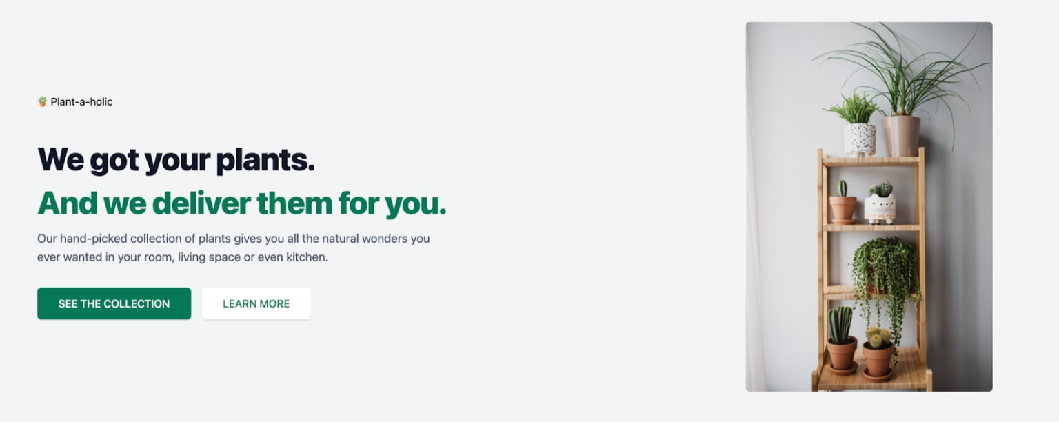
Take a look at the following Codesandbox embed of the above image:
Note that this layout which we will code is not responsive. This is suitable for the usual desktop screens and is not a responsive design. Time to get things rolling!
As we are using the default styles Tailwind provides we won’t be installing it to our project just yet. Fret not, in the next part of the series, we will install it via NPM as we need to customize the base styles.
Let your favorite code editor do its magic of adding the default semantic markup in the index.html file.
Add the following link tag after defining a suitable title for the webpage:
<link href="https://unpkg.com/tailwindcss@^2/dist/tailwind.min.css" rel="stylesheet">
Now let’s go through each of the elements we have here:
1. The body: there is just one property to define and that is the background color. It has a very light gray color so we use Tailwind’s bg-gray-100 utility class. This equals:
--tw-bg-opacity: 1;
background-color: rgba(229, 231, 235, var(--tw-bg-opacity));
You can check all the different color palette provided by Tailwind in their documentation.
2. The main container: it holds our two important layouts; to the left, we have all the text like heading, subheading, and buttons, to the right, we have the image. Now, what’s better than using the CSS native flexbox powers to achieve such layouts but no! We are not writing all those rules to make them appear side-by-side and center them, the built-in utility classes are here for you.
We simply use flex justify-center items-center classes which make items display to flex and aligns them both vertically and horizontally to center. As for some spacing we use the m-16 that applies a 4rem of margin values all around our container.
3. The heading: first we have a super small “Plant-a-holic” text, then we got our
heading make sure to give it a top margin of 1.5rem, a 3rem font-size, a suitable letter-spacing and line-height, bold weight, and a super dark gray color (not exactly black). All of these translate to the following utility classes:
mt-6 text-5xl font-headline tracking-tight font-extrabold text-gray-900 leading-snug
For the second line of our heading we can directly add it inside the
tag with the help of the element. The only difference is of color. This is like the accent color for our webpage and its value is text-green-700.
4. The paragraph: the description of the website is a
element. At first, we want to give it a width of 60% of its size so that it doesn’t span all the way towards the image we will be having later. Tailwind’s element widths are spaced by default as 1 unit = 0.25rem or 4px. More about spacings can be read here.
As w-full is assigned as width: 100%, w-1/2 is width: 50%, hence for 60% we use w-3/5 utility-first css class.
We give it a slight top margin, medium gray text color, and font-size. Note that the font-size classes come with an extra line-height property. Hence, the text-lg class becomes:
font-size: 1.125rem;
line-height: 1.75rem;
5. The buttons: as you can see from the design, there are two buttons arranged side-by-side. So, naturally, we need a wrapper around them and make it use the power of Flexbox. Hence with a proper top margin, the two classes we need here are mt-8 and flex.
Inside this div wrapper we have the two anchor tabs. Now one of these is the primary CTA (Call-To-Action) button to the left so it has most of the utility classes the same except for the text color being white and the background color of the button being the accent green color. The secondary button has properties opposite top this, so here the text color is accent green, while the button background is colored white.
One more thing though, we need some spacing between the two buttons so naturally, the secondary button needs to have a bit of left margin.
All the common properties for both include adding the usual Tailwind flex classes to center items inside it both vertically and horizontally along with the rounded borders, and a slight shadow. Here are those:
flex items-center justify-center font-medium rounded-md shadow uppercase
6. The image: to place the image we wrap it around a div with a right margin of 10rem (mr-40). The image itself was taken from a popular free stock image hosting service called Pexels. We give it a big width of 24rem (w-96), make it centered to the parent div with the help of object-cover, and to make sure that the image maintains its aspect ratio we use object-center which translated to object-fit: cover in CSS. Finally, the same border roundness is given to it as in the buttons above.
If you followed all the above steps carefully, then you should have your HTML code similar to this:
<body class="bg-gray-100">
   <div class="m-16 flex justify-center items-center">
     <div class="px-16">
       <p class="h-10">🪴 Plant-a-holic</p>
       <hr class="w-3/5" />
       <h1
         class="mt-6 text-5xl font-headline tracking-tight font-extrabold text-gray-900 leading-snug">
         We got your plants. <br />
         <span class="text-green-700">And we deliver them for you.</span>
       </h1>
       <p class="w-3/5 mt-2 text-gray-600 text-lg">
         Our hand-picked collection of plants gives you all the natural wonders
         you ever wanted in your room, living space or even kitchen.
       </p>
       <div class="mt-8 flex">
         <a
           class="flex items-center justify-center px-8 py-3 font-medium rounded-md text-white bg-green-700 shadow uppercase"
           href="#"
           >See the collection</a
         >
         <a
           class="flex items-center justify-center px-8 py-3 ml-4 font-medium rounded-md text-green-700 bg-white shadow uppercase"
           href="#"
           >Learn more</a
         >
       </div>
     </div>
     <div class="mr-40">
       <img
         class="object-cover object-center w-96 rounded-md"
         src="https://images.pexels.com/photos/3952029/pexels-photo-3952029.jpeg"
         alt="Image of plants"
       />
     </div>
   </div>
 </body>
As you can see, we are not using the recommended BEM methodology for naming as we don’t have custom CSS classes, but here is a good article on how to achieve the same if you are into that.
Conclusion
In this article, you got to know more about the core concept behind what makes Tailwind CSS a different CSS framework, i.e. the utility classes. You saw how they are formatted, how they work, how they convert to the usual CSS properties.
Finally, we took a hero section design and coded it all along with useful Tailwind code. And of course, we never wrote any CSS! Your CSS file and codebase won’t grow much even if you want to add some custom styles later.
What’s next?
In the next part of the Tailwind CSS from Zero to Hero series, we will take the existing code we wrote, make it responsive, add some interactive states, and more importantly, we will work on some custom utility classes.
There is so much to cover (including plugins, responsive breakpoints with custom media queries, more styling, using its config file, maybe using it with a JavaScript library like React) and I can’t wait for you to build some cool frontend stuff along with me!
font-size: 1.125rem;
line-height: 1.75rem;
flex items-center justify-center font-medium rounded-md shadow uppercase
<body class="bg-gray-100">
<div class="m-16 flex justify-center items-center">
<div class="px-16">
<p class="h-10">🪴 Plant-a-holic</p>
<hr class="w-3/5" />
<h1
class="mt-6 text-5xl font-headline tracking-tight font-extrabold text-gray-900 leading-snug">
We got your plants. <br />
<span class="text-green-700">And we deliver them for you.</span>
</h1>
<p class="w-3/5 mt-2 text-gray-600 text-lg">
Our hand-picked collection of plants gives you all the natural wonders
you ever wanted in your room, living space or even kitchen.
</p>
<div class="mt-8 flex">
<a
class="flex items-center justify-center px-8 py-3 font-medium rounded-md text-white bg-green-700 shadow uppercase"
href="#"
>See the collection</a
>
<a
class="flex items-center justify-center px-8 py-3 ml-4 font-medium rounded-md text-green-700 bg-white shadow uppercase"
href="#"
>Learn more</a
>
</div>
</div>
<div class="mr-40">
<img
class="object-cover object-center w-96 rounded-md"
src="https://images.pexels.com/photos/3952029/pexels-photo-3952029.jpeg"
alt="Image of plants"
/>
</div>
</div>
</body>