.gif)


What's common between circles turning to cubes, pair of shoes swinging around left to right, that cube experiencing inertia (yes, that physics thing), a text dancing when your cursor meets it, or you are just typing things in a text field and bam! That thing rotates like hell for no reason!
Well, what I'm even talking about? ┐( ̄ヘ ̄;)┌
I'm talking about some weird and super crazy web experiences you can make (including the examples I gave above) just to have some fun in your websites or implement them cautiously to make a website visitor feel joyful!
Meet this JavaScript library that can make things look cool with crazy interactions. It's called LAX!
What do I mean by relax.js? 🧐
Lax.js is a JavaScript library to create smooth & beautiful animations when you scroll.
But that's not all! Lax is really, really small. When gzipped, it's less than 4 kilobytes in size! 🤯
Here are some of its features:
- It has a new JS animation syntax for advanced animation combinations to work on.
- Now, animations can be given a kick of interia while scrolling.
- It comes with nice animation easings.
- You can create custom CSS bindings.
- Not only scroll-based, but animations can also be done while typing (we will do a demo of this later), scroll positions, or even according to date and time!
What will we make? 👀
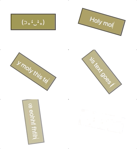
This:

Whoops! We are not doing a scroll but an input interaction here. 🤪
Let's create this input interaction 🌚
The HTML
Add an <input> field to a new or an existing project file. Make sure you give it a proper id as it will be needed later when we code the Lax logic.
Optionally, you can give it the autofocus attribute so that when the page loads, it automatically focusses on the input. This way, we can start typing weird words right away without the need of having to click on the input field. Also, we should give some placeholder value to it. Here I have just used a cute smiling kaomoji, but you can have something like, "Input here" or "type here".
The CSS
Time to make it looks like a dull stick :') I won't explain each CSS rule here, just the ones so that it looks somewhat like our finished version.
To start, remove all the borders and outlines, and give it a background-color of #95853B. As for the black colored outline you see, it's a shadow added to the element. I have used both rgba() and rgb() methods to achieve the result. Add a bit of padding, center the text, and give it a base font-size.
The Lax.js!
Installation ⬇️
You can use both Yarn or NPM scripts to install the library:
And then in your JS file, import it as usual:
Or, as I did here for the demo, grab its CDN file from JS Delivr to add it on top of your HTML <script> tags.
Setup 🛠
For the library to work, what we need is a driver at least one of the lot as it provides values for our animations, as well as the element animation bindings. This is done by the addDriver() method.
Make some interaction! ✨
We want our interaction to start on page load, or more specifically, whenever the Window is attached to the DOM. Therefore, we make use of its onload event handler to create a function that will house all of the Lax code.
Next, we initialize the library by using the init() method.
As we gave an id to the input in the HTML code, here, we will use it to grab the element and store it inside the input variable. This is a simple JS thing we do all day...
Remember I said we need to add a driver? Now we will use this driver to control the animation. Simply call lax.addDriver(). This takes in the animation value and a function that returns the calculated amount. In our case, it is the inputLength and calculating the total length of characters added in the input element.
Next, to actually start triggering the interaction, what we need is to use addElements() that takes in an element selector rule along with the animation data. Hence, we select #input and inputLength we defined previously for this.
If you notice, as soon as we start typing inside the input field, it does two things simultaneously; first, it rotates anticlockwise, and also it fades at some specific speed. This effect is achieved by using both rotate and opacity CSS properties that is supported by the Lax library.
Now from where those numbers come from? Well, technically, they are called Value Maps. These are used to manipulate the driver or CSS property values. The two values inside an object are the In and Out values. For example, the rotation above starts from 0, rotates from right to left to 180 degrees, and then to a complete circle of 160 degrees.
The same goes for opacity. To make it look like a fade-in animation, we start from 0 i.e. no fade to 1 i.e. complete fade.
Here's the complete JS code for your reference:
Here's the CodePen embed for you to play around :')
More resources 🤩
Go ahead with and learn more about Lax to make soothing interactions from these resources:
- Lax.js GitHub repo
- Lax.js Vue Example
- Laxxx.js - An Awesome Scroll Animation Library that's Only 2KB! by DesignCourse
Thanks for reading. I appreciate it! Have a good day. (✿◕‿◕✿)

.png)


