

Alpine.js is a tiny JavaScript framework with no build steps but it provides all the tools needed to build a user interface. Alpine.js allows us to write declarative codes and with a size of about 6kb, it can be seen as a modern replacement for jQuery.
Introduction
Alpine.js is a tiny JavaScript framework with no build steps but it provides all the tools needed to build a user interface. Alpine.js allows us to write declarative codes and with a size of about 6kb, it can be seen as a modern replacement for jQuery. Alpine.js shines if all that is required is a sprinkling of JavaScript for DOM manipulation based on user interaction. This is because it offers the reactivity and declarative nature of big frameworks such as Vue and React at a much lower cost.
In this article, we would be building a registration form with reactive validation using Alpine.js and Tailwind CSS. Tailwind CSS is a CSS framework that follows the atomic or functional CSS approach to CSS architecture. This approach favours small, single purposes unit of styles applied via classes.
Tailwind CSS provides these classes out of the box. And by applying these classes, we can build any design we want directly in our HTML — and avoid the hassle of writing and managing stylesheets. Alpine.js follows a similar principle by providing us with directives that can be used directly in our HTML to alter our UI. As we build our form in the subsequent section, we would elaborate more on Alpine.js directives and Tailwind CSS classes.
Let’s get started with the prerequisites in the next section.
Prerequisite
- Basic knowledge of HTML and CSS
- Basic knowledge of Tailwind CSS
- Basic knowledge of Alpine.js
Getting Started
To get started, first, we will set up our server.
Follow the steps below to create the server:
- Create an npm project and install all the needed dependencies:
mkdir <!--- project name -->
cd <!-- project name -->

# create npm project
npm init -y

# install dependencies
npm i live-server
In this project, our only dependency is the live-server package; it is a little development server with live reload capability.
- Add our scripts:
Open the package.json file and edit the scripts section as follows:
    "scripts": {
        "start": "live-server"
    },
Now we can start our sever by using: npm start.
- Create application files:
In our application folder, create an index.html file
# from the application folder run
touch index.html
Add these codes to the index.html file:
<!DOCTYPE html>
<html lang="en">
  <head>
    <meta charset="UTF-8">
    <meta http-equiv="X-UA-Compatible" content="IE=edge">
    <meta name="viewport" content="width=device-width, initial-scale=1.0">
    <link
      href="https://unpkg.com/tailwindcss@^2/dist/tailwind.min.css"
      rel="stylesheet">

    <!-- page title -->
    <title>Alpine SignUp</title>
  </head>

  <body>
    <!-- body starts-->

    <!-- body ends-->
    <script
      src="https://cdn.jsdelivr.net/gh/alpinejs/alpine@v2.8.2/dist/alpine.min.js" defer>
    </script>
  </body>
</html>
In our application boilerplate above we added both Alpine.js and Tailwind CSS using CDN. There are other methods but since our concern in this article is building HTML and CSS forms it satisfies our need.
Now that we have our application boilerplate codes, let’s start building our form in the next section.
Building A Reactive Registration Form
Add application wrapper:
In our application boilerplate code above, add the following code between the body starts and the body ends comments:
<div class="bg-gray-200 relative min-h-screen antialiased border-t-8 border-black">
  <div class="max-w-sm mx-auto px-6" x-data="getData()">
    <!-- modal starts -->
    <!-- modal ends -->

    <!-- form container starts -->
    <div
      x-show.transition="!status && !isError"
     class="relative h-screen flex flex-wrap items-center">
      <div class="w-full relative">

        <div class="mt-6">
          <div class="text-center font-semibold text-black text-2xl"> SignUp </div>
            <!-- registration form starts-->
            <!-- registration form ends -->
          </div>
        </div>
      </div>
    <!-- form container ends -->

  </div>
</div>
In the code above, two divs that act as the application wrapper. The tailwind CSS class min-h-screen in the outer div sets the min-height to 100vh; this constrains our application to the height of the viewport.
The max-w-sm class in the inner div sets the max-width property to 24rem.
Also, this div holds our state — using the x-data directive.
In Alpine.js, it is necessary to declare our state in an HTML element that encapsulates all the components we want to have access to the state. Since this div encapsulate both our modal and form — which we would create later, it is the ideal place to declare our state.
The x-data directive declares a new component scope using the given object. To keep things clean, we are returning this object from the getData function — which we would create in a moment.
Also, the x-show directive in the form container component toggles display: none; style on the div depending if the expression: "!status && !isError" resolves to true or false. The values of status and isError are also properties of the object returned from the getData function.
To create the getData function add a new script tag just above the body closing tag as seen below:
<script>
    function getData() {
        return {
            formData: {
                email: "",
                password: "",
                password_confirm: ""
            },
            status: false,
            loading: false,
            isError: false,
            modalHeaderText: "",
            modalBodyText: "",
            buttonLabel: 'Submit',
        }
    }
</script>
When we run our current code by starting our server, we get:
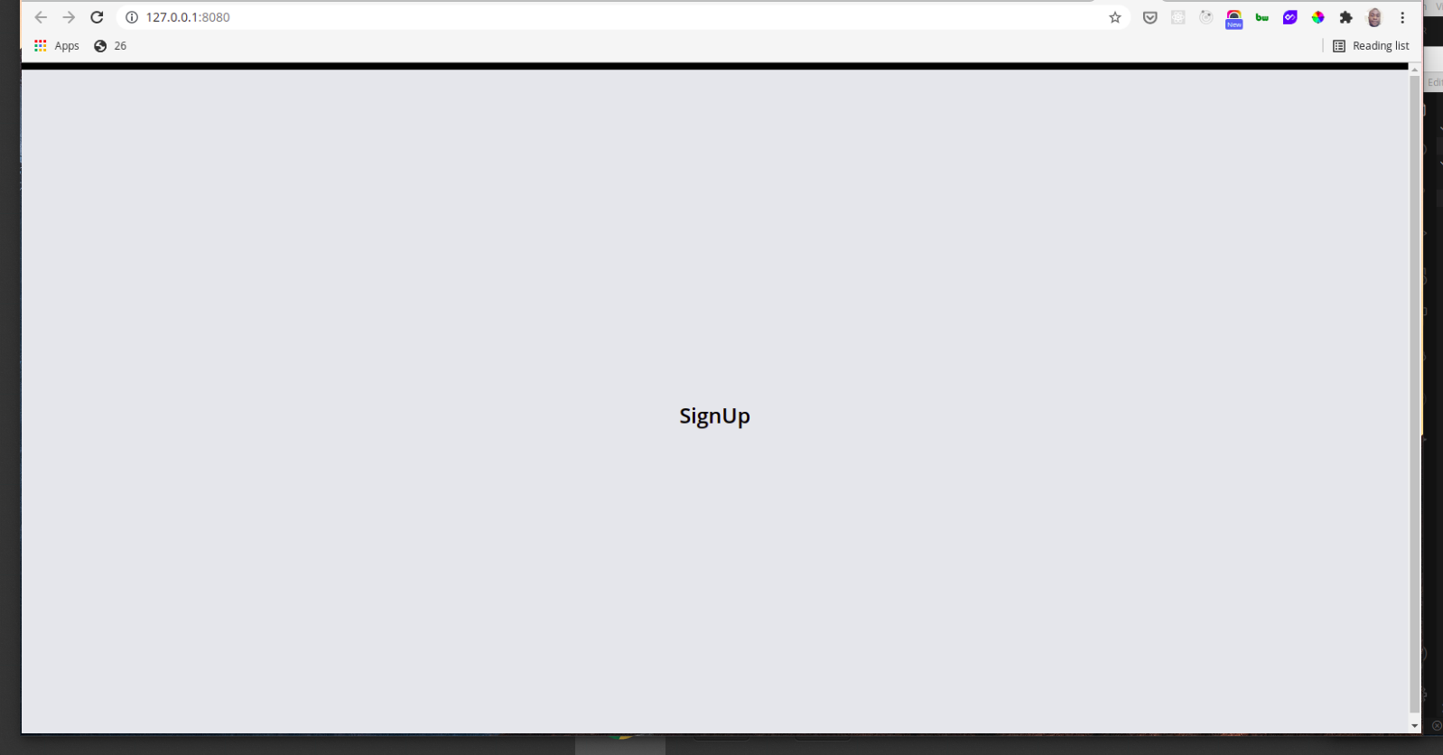
Create the registration form:
Between the registration form starts and the registration form ends comments add the following code:
<form action="/register" method="POST" class="mt-8" @submit.prevent="submitData">
  <div class="mx-auto max-w-lg ">

    <div class="py-1">
      <span class="px-1 text-sm text-gray-600">Email</span>
      <input placeholder="" type="text" x-model="formData.email"
        class="text-md block px-3 py-2 rounded-lg w-full bg-white border-2
          border-gray-300 placeholder-gray-600 shadow-md focus:placeholder-gray-500
          focus:bg-white focus:border-gray-600 focus:outline-none">
    </div>

    <div class="py-1">
      <span class="px-1 text-sm text-gray-600">Password</span>
      <input placeholder="" type="password" x-model="formData.password"
        class="text-md block px-3 py-2 rounded-lg w-full bg-white border-2
        border-gray-300 placeholder-gray-600 shadow-md focus:placeholder-gray-500
          focus:bg-white focus:border-gray-600 focus:outline-none">
    </div>

    <div class="py-1">
      <span class="px-1 text-sm text-gray-600">Password Confirm</span>
      <input placeholder="" type="password" x-model="formData.password_confirm"
        class="text-md block px-3 py-2 rounded-lg w-full bg-white border-2
        border-gray-300 placeholder-gray-600 shadow-md focus:placeholder-gray-500
        focus:bg-white focus:border-gray-600 focus:outline-none">
    </div>

    <!-- validation starts -->
    <!-- validation ends -->

    <button
      class="mt-3 text-lg font-semibold bg-gray-800 w-full text-white
      rounded-lg px-6 py-3 block shadow-xl hover:text-white hover:bg-black"
      x-text="buttonLabel" :disabled="loading">
    </button>
  </div>
</form>
In our code above, we use a shorthand syntax — @submit, for the x-on directive. The x-on directive attaches an event listener to the element and when the .prevent modifier is used — as in our form above, it calls preventDefault on the triggered event.
Also, the x-model directive adds "two-way data binding" to an element; thus it keeps the value of the input element in sync with the component data. Since our form is within the component scope created by the x-data directive we can use the formData object in our input elements.
In our form button above, we disable the button using the shorthand syntax for the x-bind directive — :disabled="loading", to disable the button when it is loading — submitting.
The x-bind directive sets the value of an attribute to the result of an expression. This expression has access to the component data and will update every time the data is updated. consequently, we can dynamically add or remove classes.
Also, the x-text directive is used to dynamically add the button text.
The x-text directive works similarly to x-bind but instead of updating the values, it updates the innerText of an HTML element.
Now our form looks like this:
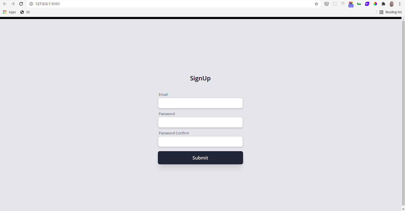
Next, we will add the codes to handle reactive validation.
Add reactive validation:
To add reactive validation to our form, add the following codes between the validation starts and validation ends comments:
<div class="flex justify-start mt-3 ml-4 p-1">
    <ul>
        <!-- Validate Email -->
        <li x-show="formData.email.length > 0" class="flex items-center py-1">
            <div
              :class="{'bg-green-200 text-green-700': isEmail(formData.email),
               'bg-red-200 text-red-700': !isEmail(formData.email)}"
                class=" rounded-full p-1 fill-current ">
                <svg class="w-4 h-4" fill="none" viewBox="0 0 24 24"
                  stroke="currentColor">
                    <path
                        x-show="isEmail(formData.email)"
                        stroke-linecap="round" stroke-linejoin="round"
                        stroke-width="2" d="M5 13l4 4L19 7" />
                    <path
                        x-show="!isEmail(formData.email)"
                        stroke-linecap="round" stroke-linejoin="round"
                        stroke-width="2" d="M6 18L18 6M6 6l12 12" />
                </svg>
              </div>
            <span
                :class="{'text-green-700': isEmail(formData.email),
                  'text-red-700': !isEmail(formData.email)}"
                class="font-medium text-sm ml-3"
                x-text="isEmail(formData.email) ?
                'Email is valid' : 'Email is not valid!' "></span>
        </li>

        <!-- Validate Password -->
        <li x-show="formData.password.length > 0" class="flex items-center py-1">
            <div
              :class="{'bg-green-200 text-green-700': formData.password.length > 7,
              'bg-red-200 text-red-700':formData.password.length < 8 }"
                class=" rounded-full p-1 fill-current ">
                <svg class="w-4 h-4" fill="none" viewBox="0 0 24 24"
                    stroke="currentColor">
                    <path
                      x-show="formData.password.length > 7" stroke-linecap="round"
                      stroke-linejoin="round"
                      stroke-width="2" d="M5 13l4 4L19 7" />
                    <path x-show="formData.password.length < 8"
                      stroke-linecap="round" stroke-linejoin="round"
                      stroke-width="2" d="M6 18L18 6M6 6l12 12" />
                </svg>
              </div>

            <span
                :class="{'text-green-700': formData.password.length > 7,
                'text-red-700':formData.password.length < 8 }"
                class="font-medium text-sm ml-3"
                x-text="formData.password.length > 7 ?
                'The minimum length is reached' :
                'At least 8 characters required' "></span>
        </li>

        <!-- Validate Password Confirm -->
        <li x-show="formData.password_confirm > 0" class="flex items-center py-1">
            <div
              :class="{'bg-green-200 text-green-700':
              formData.password === formData.password_confirm,
              'bg-red-200 text-red-700':formData.password !==
              formData.password_confirm}"
                class=" rounded-full p-1 fill-current ">
                <svg class="w-4 h-4" fill="none" viewBox="0 0 24 24"
                    stroke="currentColor">
                    <path
                        x-show="formData.password === formData.password_confirm"
                        stroke-linecap="round" stroke-linejoin="round"
                        stroke-width="2" d="M5 13l4 4L19 7" />
                    <path
                        x-show="formData.password !== formData.password_confirm"
                        stroke-linecap="round" stroke-linejoin="round"
                        stroke-width="2" d="M6 18L18 6M6 6l12 12" />
                </svg>
            </div>

            <span
                :class="{'text-green-700':
                formData.password === formData.password_confirm,
                'text-red-700':formData.password !== formData.password_confirm}"
                class="font-medium text-sm ml-3"
                x-text="formData.password === formData.password_confirm ?
                'Passwords match' : 'Passwords do not match' "></span>
        </li>

    </ul>
</div>
In our code above, the validate email logic validates user input dynamically using a function called isEmail — a method of the getData function.
We make sure the validation status message, only shows when the user starts inputting data using the x-show directive as seen below:
x-show="formData.email.length > 0"
Also, we dynamically styled the validation message using v-bind — in our case, we used the shorthand syntax :class as seen below:
:class="{'bg-green-200 text-green-700': isEmail(formData.email),
        'bg-red-200 text-red-700': !isEmail(formData.email)
  }"
To create the isEmail method, add the following code below the buttonLabel property as seen below:
...
buttonLabel: 'Submit',
isEmail(email) {
    var re = /\S+@\S+\.\S+/;
    return re.test(email);
},
...
Our small contrived regular expression above simply matches anystring@anystring.anystring — it is for example purposes only.
Similarly, the validate password logic, validates the password if the user input is at least eight characters. And the password confirm, simply makes sure both passwords are the same.
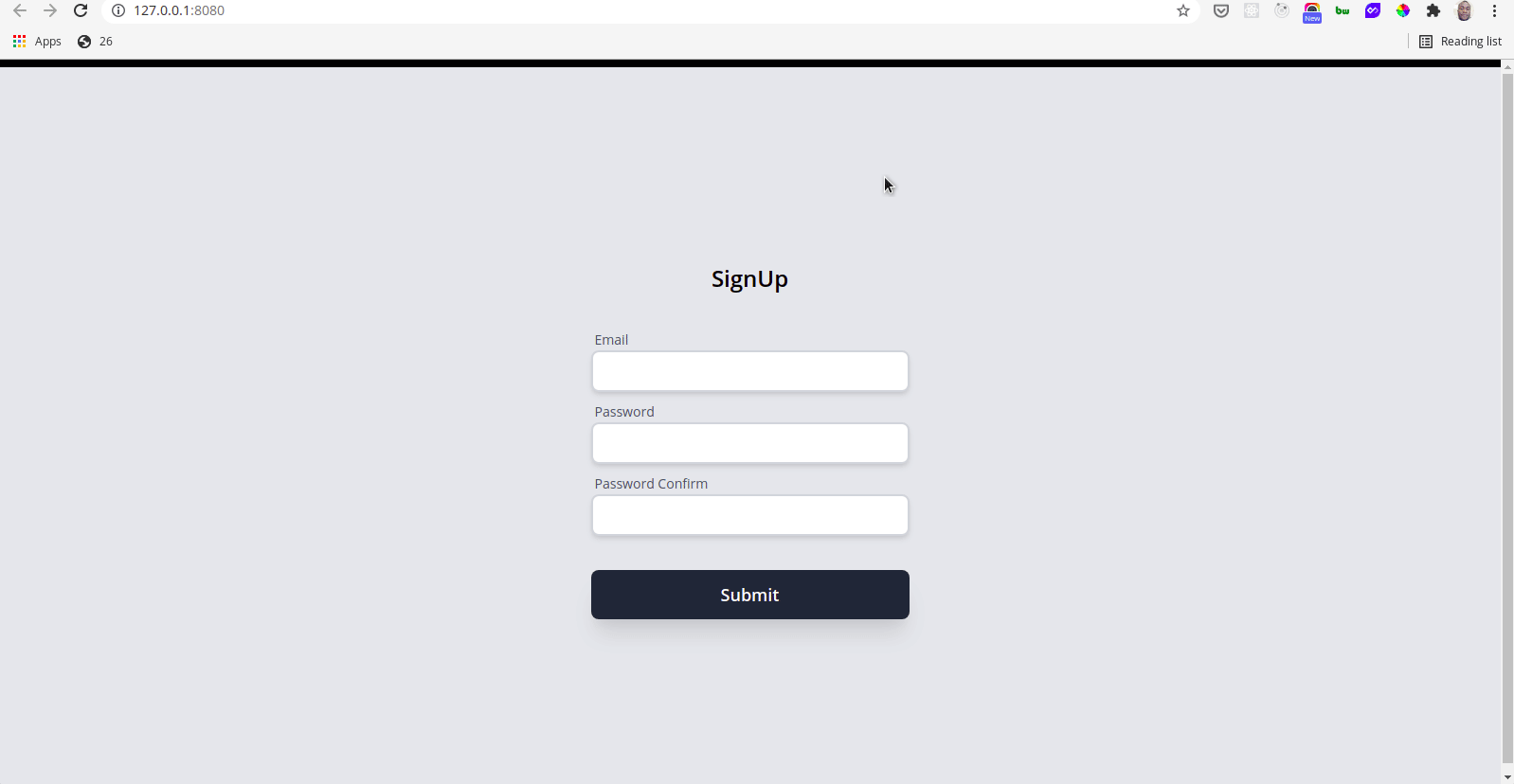
Now when we test our reactive validation we get:

Add submit logic:
To handle submitting our form, we would add a method called submitData to the getData function as seen below:
submitData() {
    // Ensures all fields have data before submitting
    if (!this.formData.email.length ||
        !this.formData.password.length ||
        !this.formData.password_confirm.length) {
        alert("Please fill out all required field and try again!")
        return;
   }
    this.buttonLabel = 'Submitting...'
    this.loading = true;
    fetch('https://reqres.in/api/users', {
            method: 'POST',
            headers: {
                'Content-Type': 'application/json'
            },
            body: JSON.stringify(this.formData)
        })
        .then((response) => {
            if(response.status === 201) {
                this.modalHeaderText = "Congratulations!!!"
                this.modalBodyText = "You have been successfully registered!";
                this.status = true;
            } else{
                throw new Error ("Your registration failed");
            }
        })
        .catch((error) => {
            this.modalHeaderText = "Ooops Error!"
            this.modalBodyText = error.message;
            this.isError = true;
        })
        .finally(() => {
            this.loading = false;
            this.buttonLabel = 'Submit'
        })
}
The submitData method above first checks to ensure that all the input fields have data before allowing submission. If any field does not contain data the alert function is called and submitData returns.
When all the input fields contain data the submitData method continues execution and temporarily sets buttonLabel to "submitting…" — which is displayed as the button text and loading to true — temporarily disabling the button.
A new user is then created by making an API to a remote API — we are using REQ | RES API in this case.
The modalHeaderText and modalBodyText are updated depending on the status of the request — these properties would be used to display the appropriate message in our modal.
Finally, the loading and buttonLabel are set to false and Submit respectively — returning our button to its normal state.
Creating our modal:
We need to create a modal to display the status of our registration. To do this, add the code below between the modal starts and modal ends comments:
<div x-show.transition="status || isError"
  style="background-color: rgb(0,0,0, .5)"
  class="mx-auto absolute top-0 left-0 w-full h-full flex items-center
      shadow-lg overflow-y-auto">
    <div class="container mx-auto rounded p-4 mt-2 overflow-y-auto">
        <div class="bg-white rounded px-8 py-8 max-w-lg mx-auto">
            <h1
                class="font-bold text-2xl mb-3 text-center"
                x-text="modalHeaderText"></h1>
            <div :class="{'text-green-700': status, 'text-red-700': isError}"
              class="modal-body text-center">
                <p x-text="modalBodyText"></p>
            </div>
            <div class="mt-4">
                <button @click="location.reload()"
                    class="mt-3 text-lg font-semibold bg-gray-800 w-full
                      text-white rounded-lg px-6 py-3 block shadow-xl
                      hover:text-white hover:bg-black">
                    Close Modal
                </button>
            </div>
        </div>
    </div>
</div>
In the code above, the x-show directive is used with the transition modifier to make our modal more pleasing using CSS transitions. And the modal is shown if status or isError evaluates to true.
The absolute class positions our modal absolutely and removes it from the document flow.
And the modal text is displayed using the x-text directive.
Our final app looks like this:
Conclusion
Alpine.js is lightweight and although it is not designed for building single-page web applications but it is great at what it does. Alpine.js, is designed to write markup-driven client-side JavaScript. If all you need is some JavaScript for DOM manipulation Alpine.js should be the go to choice and with declarative rendering it is a good replacement for jQuery.
By building our registration form above, we have demonstrated how easily we can make our UI interactive using Alpine.js. You can play with the code on Codepen. Also, you can also get the complete code on Github. And I hope after this article, you are ready to give alpine a try in your next project.


