
Explore the top 10 front-end frameworks for responsive design in 2024, including Bootstrap, Tailwind CSS, and more. Learn their pros, cons, and how to choose the right one.
Responsive web design is crucial for creating seamless user experiences across devices. This article explores the top 10 front-end frameworks for responsive design in 2024, highlighting their key features, strengths, and weaknesses.
Related video from YouTube
What changed since this list was written
Front-end CSS frameworks are an area where the fundamentals are stable but community momentum shifts quickly. A few things worth knowing before working from this list. Tailwind CSS has continued to grow and is now the dominant choice for new projects that prioritize custom design over pre-built components — Tailwind v4 shipped in early 2025 with a new CSS-first configuration model that breaks compatibility with the v3 tailwind.config.js approach described in this article. Semantic UI is worth flagging separately: the original project has been largely dormant for years, and most teams that want its component model have moved to Fomantic UI, the actively maintained community fork. Materialize CSS's maintenance status has also been uneven — verify the project's current activity before adopting it. Bootstrap 5 remains actively maintained. Foundation, Bulma, Skeleton, Pure CSS, and Milligram are all stable but have smaller contributor bases than their 2024 peak activity suggests.
Frameworks at a Glance
| Framework | Pros | Cons |
|---|---|---|
| Bootstrap | Large community, easy to use | Heavy class reliance, limited customization |
| Tailwind CSS | Highly customizable, lightweight | Learning curve, limited pre-built components |
| Foundation | Highly customizable, accessible | Steep learning curve, smaller community |
| Materialize CSS | Material Design, responsive components | Limited customization, smaller community |
| Bulma | Lightweight, easy to customize | Limited components, smaller community |
| Pure CSS | Lightweight, minimalistic | Limited components, smaller community |
| Semantic UI | Extensive components, accessible | Larger file size, limited customization |
| Skeleton | Lightweight, minimalistic | Limited components, smaller community |
| UI Kit | Extensive components, accessible | Larger file size, limited customization |
| Milligram | Lightweight, FlexBox grid | Limited components, smaller community |
When selecting a framework, consider factors such as learning curve, documentation quality, community size, customization options, and performance requirements. The right choice will depend on your specific project needs and team expertise.
What are Front-End Frameworks?
Front-end frameworks are pre-built sets of tools, libraries, and structures that help developers create responsive and interactive user interfaces for web applications. They provide a foundation for building modern web applications, making it easier to develop, maintain, and scale complex interfaces.
Benefits of Front-End Frameworks
Front-end frameworks offer several benefits, including:
| Benefit | Description |
|---|---|
| Streamlined development | Frameworks provide pre-built components, templates, and tools that reduce the time and effort required to build a web application. |
| Consistent design | Frameworks ensure consistency in design and layout, making it easier to maintain and update the application. |
| Improved user experience | Frameworks provide features and tools that enhance the user experience, such as responsive design, animations, and interactions. |
| Community support | Popular frameworks have large communities of developers who contribute to the framework, provide support, and share knowledge. |
Some popular front-end frameworks include Bootstrap, React, Angular, and Vue.js. These frameworks have become essential tools for web developers, enabling them to build complex and responsive web applications quickly and efficiently.
By using a front-end framework, developers can focus on building the application's logic and features, rather than spending time on building the underlying structure and design. This leads to faster development, improved maintainability, and a better user experience.
Choosing a Front-End Framework
When selecting a front-end framework for responsive design, consider the following key factors to make an informed decision:
Key Considerations
| Factor | Description |
|---|---|
| Responsive Grid System | Look for a framework that offers a flexible grid system that adapts to different screen sizes and devices. |
| Pre-built UI Components | Consider a framework that provides a wide range of pre-built UI components, such as buttons, forms, and navigation. |
| Customization Options | Choose a framework that offers extensive customization options, including themeing, layout, and styling. |
| Community Support | Select a framework with an active and large community of developers who contribute to the framework, provide support, and share knowledge. |
| Performance | Opt for a framework that prioritizes performance, including features like code splitting, lazy loading, and caching. |
By considering these factors, you can choose a front-end framework that meets your needs and helps you build a responsive and efficient web application.
Remember, the right framework can make a significant difference in the success of your project. Take your time to evaluate and compare different frameworks before making a decision.
1. Bootstrap
Bootstrap is a popular front-end framework for building responsive web applications. It offers a robust set of features that make it an ideal choice for developers.
Responsive Grid System
Bootstrap's grid system is designed to work well on different devices and screen sizes. It uses a 12-column layout that can be easily customized to create responsive designs.
Pre-built UI Components
Bootstrap comes with a wide range of pre-built UI components, including:
| Component | Description |
|---|---|
| Buttons | Customizable buttons with various styles and sizes |
| Forms | Pre-built form elements with validation and layout options |
| Navigation | Responsive navigation components with dropdowns and menus |
Customization Options
Bootstrap offers extensive customization options, including:
| Option | Description |
|---|---|
| Themeing | Easily change the look and feel of your application |
| Layout | Customize the layout and structure of your application |
| Styling | Use Sass or CSS to customize the styles and appearance |
Community and Documentation
Bootstrap has a large and active community of developers who contribute to the framework, provide support, and share knowledge. The framework also has extensive documentation, including tutorials, examples, and API references.
Bootstrap is a popular and widely-used front-end framework that offers a robust set of features for building responsive web applications. Its responsive grid system, pre-built UI components, and extensive customization options make it an ideal choice for developers.
2. Tailwind CSS
Responsive Grid System
Tailwind CSS offers a flexible grid system for creating responsive layouts. Instead of predefined grid classes, it provides utility classes for controlling column widths and spacing. This allows developers to build custom grid layouts that work well on different screen sizes.
Here are some key features of Tailwind's responsive grid system:
| Feature | Description |
|---|---|
| Fraction-based column widths | Use classes like w-1/2 or w-1/3 to set column widths |
| Responsive width utilities | Use classes like sm:w-full or md:w-1/2 to set responsive widths |
| Margin and padding utilities | Use classes like mx-4 or py-2 to set margin and padding |
| Nested grids | Create complex layouts by nesting grids |
Customization Options
Tailwind CSS is highly customizable, allowing developers to tailor the framework to their specific design needs. Here are some customization options:
| Option | Description |
|---|---|
| Custom breakpoints | Define custom breakpoints for responsive utilities |
| Extend default utility classes | Add new utility classes or modify existing ones |
| Create custom utility classes and components | Build custom components and utility classes |
| Modify design tokens | Update color palettes, typography, and other design elements |
Community and Documentation
Tailwind CSS has a growing community of developers who contribute to the framework, share resources, and provide support. The official documentation is comprehensive and well-organized, with examples and guides for various use cases.
Additionally, there are many third-party resources available, such as UI component libraries, templates, and learning materials, which further enhance the Tailwind ecosystem.
Performance and Overhead
One of the key advantages of Tailwind CSS is its lightweight nature and minimal overhead. Since it relies on utility classes, the file size is smaller, and load times are faster.
However, using a large number of utility classes can potentially lead to larger CSS file sizes. Tailwind provides tools like PurgeCSS to remove unused styles and optimize performance.
3. Foundation
Responsive Grid System
Foundation offers a flexible grid system that helps developers create responsive layouts. The grid system is based on a 12-column layout and includes pre-defined classes for controlling column widths, offsets, and nesting. You can customize the grid system to fit your needs by defining your own breakpoints and grid settings.
Pre-built UI Components
Foundation comes with a range of pre-built UI components, including:
| Component | Description |
|---|---|
| Navigation | Responsive navigation components with dropdowns and menus |
| Buttons | Customizable buttons with various styles and sizes |
| Forms | Pre-built form elements with validation and layout options |
Customization Options
Foundation is highly customizable, allowing you to tailor the framework to your specific design needs. You can customize everything from the grid system to the UI components using a range of tools and features.
Community and Documentation
Foundation has a large and active community of developers, with a wealth of resources and documentation available. The official documentation is comprehensive and well-organized, with examples and guides for various use cases.
Foundation is a popular front-end framework known for its flexibility and ease of use. Its responsive grid system and pre-built UI components make it a great choice for building mobile-friendly interfaces, and its customization options make it easy to tailor the framework to specific design needs.
4. Materialize CSS
Materialize CSS is a modern front-end framework that helps you build responsive and visually appealing interfaces. It's based on Google's Material Design principles and provides a set of pre-designed UI components and a flexible grid system.
Responsive Grid System
Materialize CSS features a 12-column grid system that adapts to different screen sizes and devices. You can define custom breakpoints and grid settings to fit your specific design needs.
Pre-built UI Components
Materialize CSS comes with a range of pre-built UI components, including:
| Component | Description |
|---|---|
| Navigation | Responsive navigation components with dropdowns and menus |
| Buttons | Customizable buttons with various styles and sizes |
| Forms | Pre-built form elements with validation and layout options |
Customization Options
Materialize CSS provides a range of customization options, including:
| Option | Description |
|---|---|
| Customizable grid system | Define custom breakpoints and grid settings |
| Pre-built UI components | Customize and integrate UI components into your project |
| Utility classes | Use utility classes to customize the layout and design |
Community and Documentation
Materialize CSS has an active community of developers and a comprehensive documentation set. The official documentation provides examples, guides, and tutorials to help you get started with the framework and make the most of its features.
Materialize CSS is a popular front-end framework that is known for its ease of use and responsive design capabilities. Its pre-built UI components and customizable grid system make it a great choice for building mobile-friendly interfaces.
5. Bulma
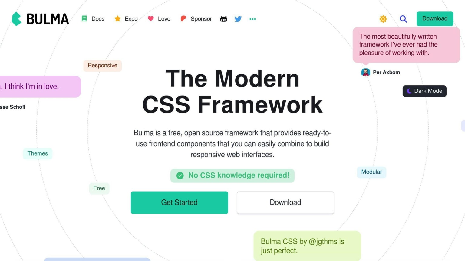
Bulma is a modern, lightweight CSS framework that helps you build responsive and visually appealing interfaces. It's based on Flexbox and provides a set of pre-designed UI components and a flexible grid system.
Responsive Grid System
Bulma's grid system is based on a 12-column layout. You can define custom breakpoints and grid settings to fit your specific design needs. The grid system is flexible, making it easy to create complex layouts.
Pre-built UI Components
Bulma comes with a range of pre-built UI components, including:
| Component | Description |
|---|---|
| Navigation | Responsive navigation components |
| Buttons | Customizable buttons with various styles and sizes |
| Forms | Pre-built form elements with validation and layout options |
Customization Options
Bulma provides a range of customization options, including:
| Option | Description |
|---|---|
| Modular architecture | Import only the components you need |
| SASS variables | Customize the design using SASS variables |
Community and Documentation
Bulma has an active community of developers and a comprehensive documentation set. The official documentation provides examples, guides, and tutorials to help you get started with the framework and make the most of its features.
Bulma is a popular front-end framework known for its ease of use, responsiveness, and high customizability. Its pre-built UI components and flexible grid system make it a great choice for building mobile-friendly interfaces.
6. Pure CSS
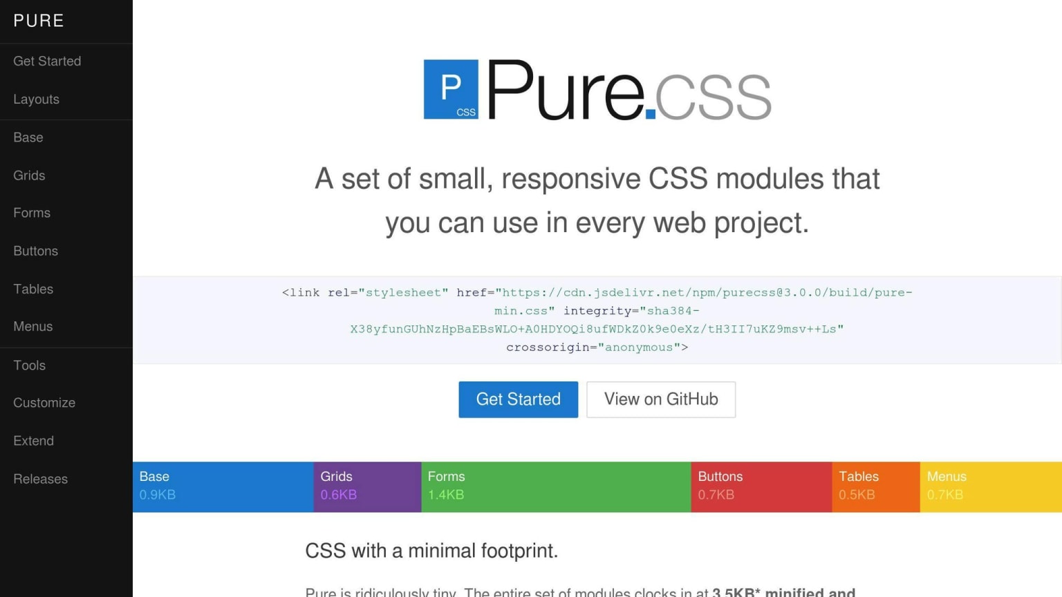
Pure CSS is a lightweight and simple CSS framework that helps you build responsive and mobile-friendly interfaces. It's designed to be easily customizable and provides a small set of CSS modules that you can use in your web projects.
Responsive Grid System
Pure CSS comes with a responsive grid system that allows you to create layouts that work well on different screen sizes. The grid system is based on a 12-column layout, and you can define custom breakpoints and grid settings to fit your specific design needs.
Pre-built UI Components
Pure CSS provides a range of pre-built UI components, including:
| Component | Description |
|---|---|
| Grids | Responsive grid layouts |
| Forms | Pre-built form elements with validation and layout options |
| Buttons | Customizable buttons with various styles and sizes |
| Tables | Responsive table layouts |
| Menus | Responsive navigation components |
Customization Options
Pure CSS offers a range of customization options, including:
| Option | Description |
|---|---|
| Override styles | Customize the framework's default styles |
| Add custom CSS rules | Add your own CSS rules to tailor the framework |
| Use CSS pre-processors | Use LESS or SASS to customize the framework |
Performance and Overhead
One of the key benefits of Pure CSS is its small size and lightweight architecture. The entire framework is only 3.7KB minified and gzipped, making it a great choice for projects where speed and performance are a priority.
Overall, Pure CSS is a great choice for developers who want a lightweight and customizable CSS framework that can help them build responsive and mobile-friendly interfaces. Its small size, responsive grid system, and range of pre-built UI components make it a popular choice among developers.
7. Semantic UI
Semantic UI is a popular front-end framework that helps you build responsive and mobile-friendly interfaces. It's known for its easy-to-use and human-friendly approach.
Responsive Grid System
Semantic UI comes with a responsive grid system that allows you to create layouts that work well on different screen sizes. The grid system is based on a 12-column layout, and you can define custom breakpoints and grid settings to fit your specific design needs.
| Grid Class | Description |
|---|---|
ui grid |
Creates a responsive grid layout |
ui stackable grid |
Creates a responsive grid layout that stacks on smaller screens |
Pre-built UI Components
Semantic UI provides a range of pre-built UI components, including:
| Component | Description |
|---|---|
| Buttons | Customizable buttons with various styles and sizes |
| Forms | Pre-built form elements with validation and layout options |
| Menus | Responsive navigation components |
| Tables | Responsive table layouts |
Customization Options
Semantic UI offers a range of customization options, including:
| Option | Description |
|---|---|
| Themes | Customize the framework's default styles |
| Layouts | Customize the layout and structure of your application |
| UI Components | Customize the pre-built UI components to fit your design needs |
Overall, Semantic UI is a powerful and flexible front-end framework that provides a range of tools and components for building responsive and mobile-friendly interfaces. Its easy-to-use approach makes it a great choice for developers who want to build fast and efficient.
8. Skeleton
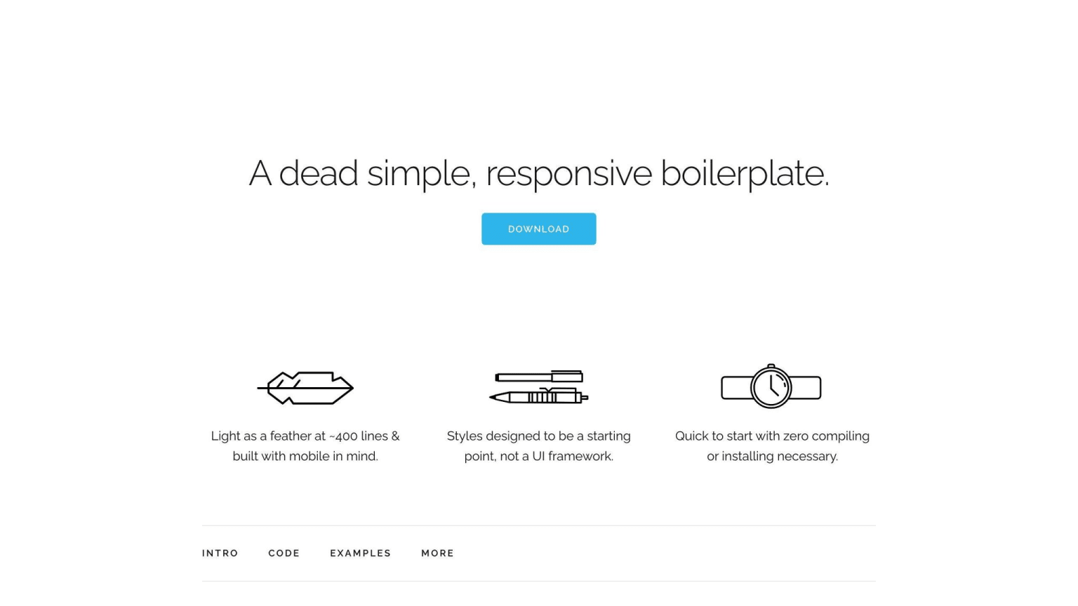
Skeleton is a lightweight front-end framework that provides a basic structure for building responsive designs. Its simplicity makes it an attractive choice for developers who want to create fast and efficient interfaces.
Customization Options
Skeleton is highly customizable due to its minimalistic approach. With fewer predefined styles, developers have the freedom to create unique designs that fit their specific needs. This means that more custom CSS needs to be written to achieve complex designs.
Performance and Overhead
Skeleton's lightweight nature results in a smaller file size, leading to faster load times and improved performance. Its simplicity also means it requires less overhead, making it an excellent choice for projects that require a quick and efficient development process.
Here are some key benefits of using Skeleton:
| Benefit | Description |
|---|---|
| Lightweight | Smaller file size for faster load times |
| Customizable | Freedom to create unique designs with minimal predefined styles |
| Efficient | Requires less overhead for quick development |
Overall, Skeleton is a great choice for developers who want a lightweight and customizable framework that provides a solid foundation for building responsive designs. Its simplicity and performance make it an attractive option for projects that require speed and efficiency.
9. UI Kit
Responsive Grid System
UI Kit offers a responsive grid system that helps you create layouts that work well on different screen sizes and devices. The grid system is based on a 12-column layout, which can be easily customized to fit your specific needs.
Pre-built UI Components
UI Kit comes with a range of pre-built UI components, including HTML, CSS, and JS elements. These components are designed to be easy to use and highly customizable. With UI Kit, you can quickly build responsive interfaces with minimal coding required.
Customization Options
UI Kit provides a high degree of customization, thanks to its modular structure and support for LESS and SASS preprocessors. You can easily extend or modify the framework to fit your specific design requirements.
Performance and Overhead
UI Kit is a lightweight framework, which means it has a smaller file size and requires less overhead. This results in faster load times and improved performance.
Here are some key benefits of using UI Kit:
| Benefit | Description |
|---|---|
| Responsive Design | Works well on different screen sizes and devices |
| Easy to Use | Pre-built UI components make it easy to build responsive interfaces |
| Customizable | Modular structure and support for LESS and SASS preprocessors |
| Lightweight | Smaller file size for faster load times and improved performance |
10. Milligram
Milligram is a lightweight responsive web design framework that is exceptional due to its conformance to the CSS FlexBox Grid Modules. This framework is minimalistic in design and occupies only 2 KB of space when compressed, making it an ideal choice for projects that require a fast and clean starting point.
Responsive Grid System
Milligram's grid system is fluid and has a max width of 70.0rem (1120px), which shrinks with the browser/device at smaller sizes. The max width can be changed with one line of CSS, and all columns will resize accordingly. The grid system follows a row/column naming convention that is easy to understand, even in complex applications.
Pre-built UI Components
Milligram includes basic components such as typography, buttons, blockquotes, tables, lists, and forms. These components are designed to be easy to use and customize.
Customization Options
Milligram provides a high degree of customization due to its minimalistic design and support for modern browsers. You can easily extend or modify the framework to fit your specific design requirements.
Here are some key benefits of using Milligram:
| Benefit | Description |
|---|---|
| Lightweight | Only 2 KB in size when compressed |
| Responsive Design | Works well on different screen sizes and devices |
| Easy to Use | Basic components are easy to use and customize |
| Customizable | Minimalistic design and support for modern browsers |
Framework Comparison
When choosing a front-end framework for responsive design, it's essential to consider the strengths and weaknesses of each option. Here's a comparison of the top 10 front-end frameworks for responsive design in 2024:
Bootstrap
| Pros | Cons |
|---|---|
| Large community | Heavy reliance on classes |
| Easy to use and learn | Limited customization options |
| Excellent responsive design capabilities | Potential for bloated HTML markup |
Bootstrap is a popular front-end framework known for its ease of use and extensive documentation. It offers a wide range of pre-built components and a robust grid system for responsive design. However, its reliance on classes can make the codebase harder to maintain, and customization can be challenging.
Tailwind CSS
| Pros | Cons |
|---|---|
| Highly customizable | Learning curve for utility classes |
| Lightweight and performant | Limited pre-built UI components |
| Developer-friendly utility classes |
Tailwind CSS takes a different approach to styling by providing a set of utility classes instead of pre-built components. This makes it highly customizable and lightweight, but it also has a learning curve, and developers may need to build UI components from scratch.
Foundation
| Pros | Cons |
|---|---|
| Highly customizable and modular | Steep learning curve |
| Accessibility features built-in | Smaller community compared to Bootstrap |
| Lightweight and flexible |
Foundation by Zurb is a highly customizable and modular framework that offers excellent responsive design capabilities. It includes built-in accessibility features and is lightweight, but it has a steeper learning curve and a smaller community compared to Bootstrap.
Materialize CSS
| Pros | Cons |
|---|---|
| Based on Google's Material Design | Limited customization options |
| Responsive and interactive components | Smaller community compared to others |
| Animations and transitions support |
Materialize CSS is based on Google's Material Design language and provides responsive and interactive components with animations and transitions support. It's easy to learn and use, but it may have limited customization options and a smaller community compared to other frameworks.
Bulma
| Pros | Cons |
|---|---|
| Lightweight and modular | Limited pre-built components |
| Easy to customize | Smaller community compared to others |
| Responsive grid system |
Bulma is a modern and lightweight CSS framework that focuses on simplicity and flexibility. It offers a responsive grid system and is easy to customize, but it has a limited set of pre-built components and a smaller community compared to other frameworks.
Pure CSS
| Pros | Cons |
|---|---|
| Lightweight and minimalistic | Limited pre-built components |
| Easy to customize | Smaller community compared to others |
| Responsive grid system |
Pure CSS is a lightweight and minimalistic framework that provides a responsive grid system and cross-browser compatibility. It's easy to customize, but it has a limited set of pre-built components and a smaller community compared to other frameworks.
Semantic UI
| Pros | Cons |
|---|---|
| Extensive set of pre-built components | Larger file size compared to others |
| Responsive and accessible design | Limited customization options |
| Theming and customization options |
Semantic UI is a framework that offers an extensive set of pre-built components, responsive and accessible design, and theming and customization options. It has excellent documentation and support, but it may have a larger file size and limited customization options compared to other frameworks.
Skeleton
| Pros | Cons |
|---|---|
| Lightweight and minimalistic | Limited pre-built components |
| Easy to customize | Smaller community compared to others |
| Responsive grid system |
Skeleton is a lightweight and minimalistic framework that provides a responsive grid system and cross-browser compatibility. It's easy to customize, but it has a limited set of pre-built components and a smaller community compared to other frameworks.
UI Kit
| Pros | Cons |
|---|---|
| Extensive set of pre-built components | Larger file size compared to others |
| Responsive and accessible design | Limited customization options |
| Theming and customization options |
UI Kit offers an extensive set of pre-built components, responsive and accessible design, and theming and customization options. It has excellent documentation and support, but it may have a larger file size and limited customization options compared to other frameworks.
Milligram
| Pros | Cons |
|---|---|
| Lightweight and minimalistic | Limited pre-built components |
| Responsive grid system based on CSS FlexBox | Smaller community compared to others |
| Easy to customize and extend |
Milligram is a lightweight and minimalistic framework that provides a responsive grid system based on CSS FlexBox. It's easy to customize and extend, and it conforms to modern browser standards, but it has a limited set of pre-built components and a smaller community compared to other frameworks.
When choosing a front-end framework for responsive design, consider factors such as project requirements, team expertise, learning curve, customization options, community support, and performance. Each framework has its strengths and weaknesses, and the right choice will depend on your specific needs and preferences.
Tailwind v4 and what it changes for framework selection
Tailwind CSS v4, released in early 2025, is a meaningful enough shift that it is worth addressing separately if you are choosing a framework today. The v3 approach used a JavaScript config file (tailwind.config.js) to define design tokens — that model still works, but v4 defaults to a CSS-first configuration approach using @theme directives directly in your stylesheet. The build system also moved from PostCSS-only to a dedicated Rust-based toolchain (Oxide), which makes cold builds significantly faster. What this means practically: if you are starting a new project and choosing Tailwind, read the v4 migration guide before adopting patterns from articles written before 2025. The utility class names themselves are largely the same, but the configuration and plugin API changed. For teams already on Tailwind v3, migration is not urgent but is worth planning — the gap between v3 and v4 patterns will widen over time as the ecosystem catches up to the new config model.
Conclusion
Choosing the right front-end framework for responsive design is crucial for creating seamless user experiences across devices. With many frameworks available, it's essential to evaluate your project requirements, team expertise, and priorities.
Framework Comparison
Here's a comparison of the top 10 front-end frameworks for responsive design in 2024:
| Framework | Pros | Cons |
|---|---|---|
| Bootstrap | Large community, easy to use and learn | Heavy reliance on classes, limited customization options |
| Tailwind CSS | Highly customizable, lightweight and performant | Learning curve for utility classes, limited pre-built UI components |
| Foundation | Highly customizable and modular, accessibility features built-in | Steep learning curve, smaller community compared to Bootstrap |
| Materialize CSS | Based on Google's Material Design, responsive and interactive components | Limited customization options, smaller community compared to others |
| Bulma | Lightweight and modular, easy to customize | Limited pre-built components, smaller community compared to others |
| Pure CSS | Lightweight and minimalistic, responsive grid system | Limited pre-built components, smaller community compared to others |
| Semantic UI | Extensive set of pre-built components, responsive and accessible design | Larger file size compared to others, limited customization options |
| Skeleton | Lightweight and minimalistic, responsive grid system | Limited pre-built components, smaller community compared to others |
| UI Kit | Extensive set of pre-built components, responsive and accessible design | Larger file size compared to others, limited customization options |
| Milligram | Lightweight and minimalistic, responsive grid system based on CSS FlexBox | Limited pre-built components, smaller community compared to others |
When selecting a framework, consider factors such as the learning curve, documentation quality, and the size of the developer community. Frameworks with larger communities often benefit from more comprehensive resources, active development, and better long-term support.
Ultimately, the choice of a front-end framework should align with your project goals, development workflow, and the desired balance between ease of use and customization. By carefully evaluating the options and selecting the framework that best fits your needs, you can streamline the development process, ensure consistent responsive design, and deliver exceptional user experiences across all devices.
FAQs
What is the most popular FE framework?
Some popular frontend frameworks include React, Angular, Vue.js, and Svelte. These frameworks help developers create interactive and dynamic web applications with modern user interfaces more efficiently.
Can websites be hacked with CSS exploits?
CSS alone cannot be used to hack a website or harm a server. However, CSS can be used with other web technologies to potentially exploit vulnerabilities in a website or server. This type of attack is known as a "cross-site scripting" (XSS) attack.
Bootstrap or Tailwind CSS: Which one is better?
The choice between Bootstrap and Tailwind depends on your project needs and preferences. Bootstrap provides a more out-of-the-box solution, while Tailwind offers a more flexible and customizable approach.
| Framework | Description |
|---|---|
| Bootstrap | More out-of-the-box solution, easier to learn |
| Tailwind | More flexible and customizable, requires more learning |
Remember, the best framework for your project depends on your specific needs and the skills of your development team.