

A burndown chart only works when teams update it daily, size tasks small, document scope changes, and use metrics together.
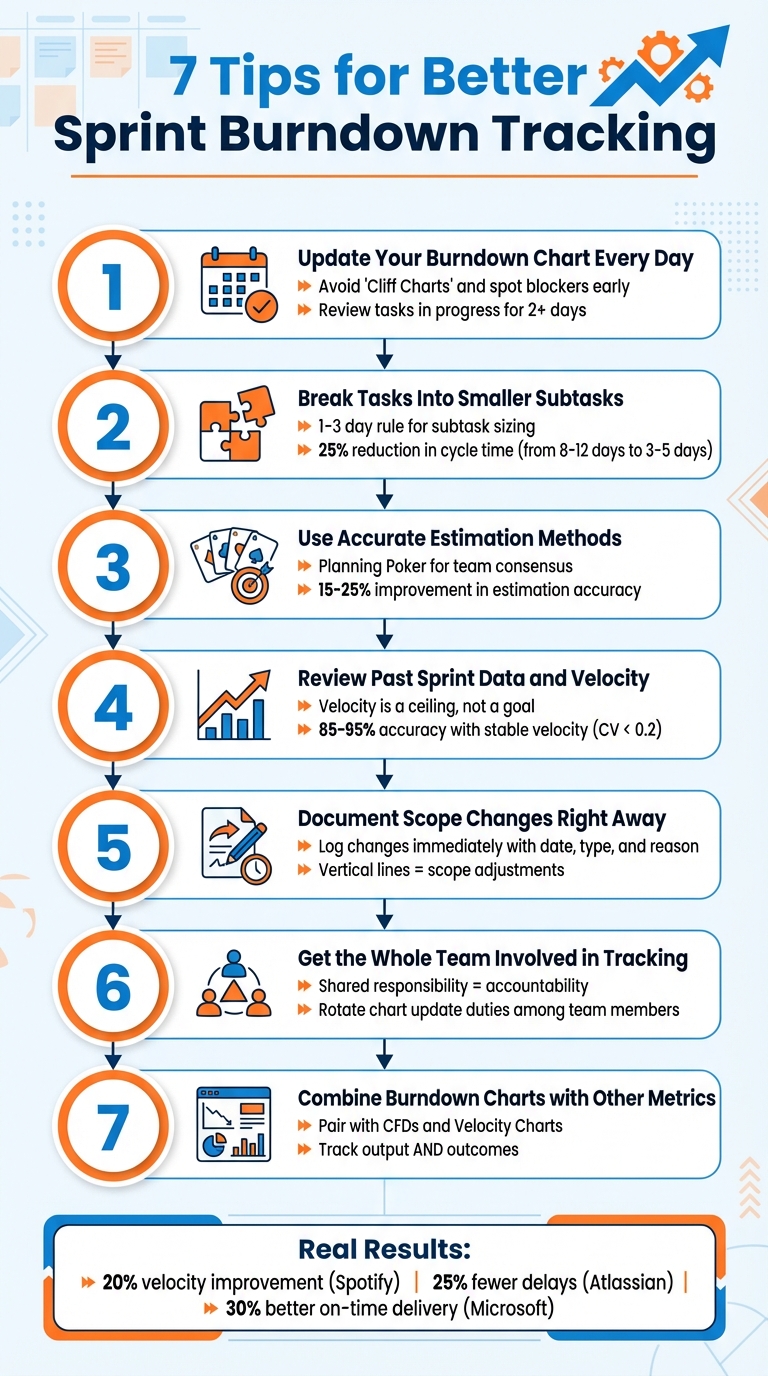
Sprint burndown charts are essential for tracking progress in Agile workflows. They help teams visualize remaining work versus time left, identify bottlenecks, and adjust plans to stay on track. Here’s a quick breakdown of the seven key ways to improve your burndown tracking:
- Update Daily: Keep charts current to spot blockers early and avoid misleading "Cliff Charts."
- Break Tasks Down: Use smaller subtasks (1–3 days) for better progress visibility and reduced cycle times.
- Use Accurate Estimates: Methods like Planning Poker improve estimation accuracy by up to 25%.
- Review Past Data: Historical velocity helps set realistic goals and interpret trends.
- Document Scope Changes: Log changes immediately to maintain chart accuracy and transparency.
- Involve the Team: Shared responsibility ensures accountability and real-time problem-solving.
- Combine Metrics: Pair burndown charts with tools like Cumulative Flow Diagrams for deeper insights.
7 Tips for Better Sprint Burndown Tracking in Agile Teams
How to CORRECTLY use the Sprint Burndown Chart (most people get this wrong..)
1. Update Your Burndown Chart Every Day
Keeping your burndown chart updated daily transforms it into a powerful early warning system. Regular updates help identify problems before they escalate. As Joel Bancroft-Connors from Applied Frameworks puts it:
"The difference in trajectory between the ideal and actual lines serve as a leading metric - an early warning system - for the team."
Use the Daily Scrum to review the task board and update the chart. Pay close attention to tasks that have been "in progress" for more than two days - this often indicates a blocker or unexpected complexity.
Failing to update the chart daily can delay issue detection. This can result in "Cliff Charts", where progress appears stagnant and then suddenly drops when updates are made in bulk. Brian Conn, Founder of Connsulting, cautions:
"Teams who make batch updates to all their tickets every few days or once a week will wreak havoc on Agile metrics like average time in progress, average WIP (work in progress), and overall ticket cycle time."
To make daily updates more effective, break tasks into smaller chunks of about four hours of work. And if you're using a manual chart, skip weekends to prevent misleading plateaus in your data trends.
2. Break Tasks Into Smaller Subtasks
Breaking down tasks into smaller, more manageable subtasks is a game-changer for tracking progress effectively. When tasks are too large, they tend to linger on your burndown chart as flat lines, giving the illusion that nothing is moving forward. Why? Because these large tasks remain "in progress" for days without any visible updates. Tracking only high-level User Stories or Product Backlog Items often leads to a lack of detail, making it harder to gauge daily progress. Joel Bancroft-Connors from Applied Frameworks highlights this issue:
"If the team only tracks at the Product Backlog Item... they won't have the granularity to see progress and projections for being done will be off."
By breaking work into smaller subtasks, teams gain access to daily progress insights. The results speak for themselves: teams that adopt structured sub-issues report a 25% reduction in cycle time, with the average cycle time dropping from 8–12 days to just 3–5 days. Even better, missed SLAs decrease significantly - from 35% to 12% - when tasks are properly decomposed.
To maximize effectiveness, aim to structure each subtask so it can be completed within 1–3 days, or even better, within 4 hours. This approach creates natural checkpoints, making it easier to spot and address blockers early. Chaissan Ashcroft from Zenhub emphasizes this principle:
"The 1-3 day rule is your north star for Sub-issue sizing. Every Sub-issue should represent work one contributor can complete within three days or less."
Smaller subtasks also help avoid the common pitfalls of large tasks, such as unclear completion criteria and scope creep. These issues often transform straightforward tasks into drawn-out projects spanning weeks. By defining subtasks clearly, everyone knows exactly what "done" looks like, turning your burndown chart into a reliable tool for forecasting progress.
3. Use Accurate Estimation Methods
Getting your estimations right is key to making your burndown chart a true reflection of your progress. When your estimates are off, the chart can either give you a false sense of security or create unnecessary panic about falling behind. The fix? Pick an estimation method that aligns with your team's workflow and stick to it.
One of the most popular methods is Planning Poker. Here’s how it works: team members use a modified Fibonacci sequence (1, 2, 3, 5, 8, 13) to reveal their estimates simultaneously. This technique is highly effective - experienced teams reach agreement on their first vote 60–70% of the time and can process 4–6 stories per hour. Compared to traditional time-based methods, Planning Poker improves estimation accuracy by 15–25%. Mike Cohn, founder of Mountain Goat Software, highlights the value of this approach:
"By intentionally leaving some numbers out of the set of acceptable estimates, teams avoid bogging down in discussions of, for example, 15 versus 16".
This deliberate omission of certain numbers eliminates unnecessary debates over minor differences, keeping the process efficient.
For high-level planning or discussions with non-technical stakeholders, T-Shirt Sizing (XS, S, M, L, XL) is a great alternative. It dramatically reduces the time spent on numeric estimations - by as much as 80%. On the other hand, if you’re managing a large backlog (50–500 items), the Bucket System can help. This method processes 50–100 items per hour while still maintaining 80–85% of Planning Poker’s accuracy.
Wide-ranging estimates can actually be a good thing - they often reveal hidden challenges or technical debt. When your team’s estimates vary significantly, ask those with the highest and lowest numbers to explain their reasoning. As Magne Jørgensen from Simula Research Lab advises:
"The people most competent in solving the task should estimate it".
And if your team can’t agree after a few rounds, James Grenning, the creator of Planning Poker, suggests:
"If you can't get consensus, don't sweat it. It is only one story out of many. Defer the story, split it, or take the low estimate".
To keep estimates consistent, use reference stories - completed tasks that act as benchmarks. For instance, if adding a form field was a 1-point story and building a new API endpoint was a 3-point story, use these as guides for sizing future work. Any story estimated at 13 points or higher should be broken down into smaller tasks. And when in doubt, round up to account for any uncertainty.
4. Review Past Sprint Data and Velocity
Looking back at previous sprints can help you spot potential problems before they slow down progress. A key metric to consider is historical velocity, which is the average number of story points completed across your last 3–5 sprints. This gives you a realistic upper limit for what your team can achieve. As Gary Worthington from More Than Monkeys explains:
"Velocity is a ceiling, not a goal".
In other words, treat your average velocity as a planning boundary, not a target to exceed. Teams that push velocity as a performance metric often inflate their estimates, leading to a 34% drop in estimation accuracy within six months.
Historical velocity also helps you interpret current burndown charts more effectively. For example, if your burndown chart shows a "Slow Start", it could point to technical design challenges or tasks that haven’t been broken down enough. A "Cliff Chart", where most work completes at the end of the sprint, might indicate oversized tasks or a lack of focus on peer reviews. If the chart stalls or even rises mid-sprint, it could signal scope creep or blocked tasks. By tracking these patterns over time, you can identify and fix the root causes instead of just addressing the symptoms.
Use your velocity data to predict sprint outcomes and adjust your plans as needed. If your current trend shows you’ll exceed the sprint’s timebox, work with your Product Owner to reduce the scope. Teams with stable velocity trends - those with a coefficient of variation below 0.2 - can achieve 85–95% accuracy in meeting their commitments. This consistency builds stakeholder confidence and improves release planning.
Don’t forget to account for context. For example, if team members are on vacation, new hires are onboarding, or the sprint coincides with holidays, you’ll need to lower your planned capacity. After significant changes to the team or processes, recalibrate your velocity by averaging the next 2–3 sprints until things stabilize. The key is to rely on data-driven decisions, not guesswork. Use these insights to refine your sprint scope and execution strategies.
sbb-itb-bfaad5b
5. Document Scope Changes Right Away
Keeping up with consistent daily updates is only part of the equation. To ensure your burndown chart accurately reflects what's happening in the sprint, you need to document scope changes as soon as they occur.
When tasks are added or removed mid-sprint, your burndown chart must reflect these changes immediately. If you delay, the chart might show a flat or even rising line, which could misleadingly suggest a lack of progress.
As Joel Bancroft-Connors from Applied Frameworks explains:
"Vertical lines mean that tasks were added or removed from the Burndown (and the Backlog)."
These vertical markers provide a clear visual signal that the sprint scope has shifted. However, they only appear if you update the chart at the moment of the change.
At the start of each sprint, record the committed issues and planned points. Then, for every scope change, log the details in a table with fields like date, type, issue ID, reason, and tradeoff. For example, if a customer requests an urgent feature, document which lower-priority task gets replaced. This "Add X, Remove Y" approach helps balance sprint capacity while maintaining an accurate chart.
Use tags like scope-change in your project management tool to flag mid-sprint adjustments. This makes post-sprint reporting clearer and helps identify recurring patterns during retrospectives, such as unexpected dependencies or urgent last-minute requests.
Natalija Fuksmane from Atlassian highlights the benefits of this practice:
"Scope change information should equip you with the right amount of detail to manage your team's sprint priorities effectively. Faster decision-making will help your team achieve their sprint goals."
Preserve the original estimates for all tasks to avoid distorting your data. Document any discrepancies for review during retrospectives to ensure clarity and improve future planning.
6. Get the Whole Team Involved in Tracking
Tracking the sprint burndown chart shouldn't fall solely on the Scrum Master or project manager. When the entire team takes part in updating and monitoring it, the chart transforms into a shared tool for spotting issues early and promoting accountability.
By shifting from individual task ownership to a team-wide responsibility, you help eliminate silos. Instead of being fixated on personal tasks, the team starts viewing the sprint goal as a collective mission.
Building on the importance of daily updates and scope documentation, involving everyone in tracking adds another layer of clarity and accountability. Make it a habit to update the chart during your Daily Scrum. As the team reviews the board and tracks progress together, it naturally sparks discussions about challenges. If progress veers off course, the team can address issues immediately - whether that means tackling a blocked task as a group or reprioritizing with the Product Owner. This makes the burndown chart a tool for real-time problem-solving and ongoing improvement.
To keep everyone engaged, rotate the responsibility of chart updates among team members. This not only ensures that everyone understands how their work impacts the sprint but also keeps the chart accurate and useful. Annotate any blockers directly on the chart to maintain it as the single source of truth, fostering accountability across the board.
7. Combine Burndown Charts with Other Metrics
Once you've fine-tuned your internal tracking, it's time to bring in additional metrics to get a clearer picture of your team's progress. Burndown charts are great for showing how much work has been completed, but they don't reveal the underlying causes of delays or inefficiencies. Pairing them with other tools can provide a more complete understanding.
For example, Cumulative Flow Diagrams (CFDs) can help you identify where work tends to pile up and highlight bottlenecks. If your burndown chart shows a plateau, a CFD might reveal whether tasks are stuck in peer review, QA, or some other stage. Agile coach Ken Furlong explains it well:
"The big paradigm shift in the CFD is that it exposes lots of critical flow information... visualizing the amount of Work In Progress (WIP) at each interval".
In a CFD, the height of each band represents the amount of WIP. If one band grows taller, it's a clear signal of a bottleneck that needs attention.
Velocity charts are another valuable tool, helping you set realistic sprint goals based on past performance. By analyzing your team's average velocity from the last three to five sprints, you can make more informed commitments during sprint planning. Then, use the burndown chart to monitor whether you're staying on track. Combining these metrics gives you a more rounded view of your sprint's progress, building on daily updates for a deeper analysis.
Here’s a quick breakdown of these metrics and how to use them effectively:
Metric
Primary Question
Best Daily Use
Burndown Chart
Will we finish on time?
Daily tracking
Cumulative Flow Diagram
Where is work getting stuck?
Identifying bottlenecks and managing WIP
Velocity Chart
How much can we commit to?
Sprint planning and capacity estimation
Cycle Time
How long does one item take?
Measuring process efficiency
It's also important to remember that burndown charts focus on tracking output - not necessarily outcomes. As The Gorilla Coach puts it:
"Burndown charts are great at tracking work completion (output), however, they do not tell you if the work being completed is valuable (outcome)".
To ensure your team is delivering meaningful results, consider pairing burndown charts with outcome metrics or OKR tracking. By blending insights from burndown charts, CFDs, and velocity charts, you can identify and resolve issues more quickly, giving your team a better chance of hitting its sprint goals.
Conclusion
These seven tips can turn your sprint burndown chart into a powerful tool for fostering clarity and spotting risks early. By updating the chart daily, breaking tasks into smaller chunks, and involving the entire team, you create a shared understanding of priorities and progress.
Consider the results achieved by some industry leaders: Spotify increased sprint predictability and improved team velocity by 20% in just three months. Atlassian reduced project delays by 25% by enhancing cross-functional visibility. Microsoft saw a 30% improvement in on-time delivery rates for Office 365 by staying on top of dependencies. These examples highlight how consistent tracking and effective scope management can drive measurable results.
FAQs
What should I do when the burndown line goes up mid-sprint?
If the burndown line starts climbing mid-sprint, it typically indicates that new work was added or existing tasks were re-estimated. To handle this, start by pinpointing the root cause - this could be anything from unexpected bottlenecks to inaccurate initial estimates.
One way to address this is by breaking larger tasks into smaller, more manageable ones. Make it a habit to review the burndown chart frequently and maintain open communication with your team to ensure everyone understands the changes. Instead of seeing the upward trend as a setback, view it as an opportunity to identify and resolve issues, ultimately improving how you track and manage sprints.
How do we track progress when stories are too big to move daily?
To keep tabs on progress for larger stories, it's helpful to focus on broader tracking methods. An Epic Burndown Chart is a great tool for visualizing progress over multiple sprints. During backlog grooming, break these large stories into smaller, manageable tasks. This approach makes progress easier to measure. By tracking the completion of these smaller tasks rather than the big story as a whole, you can maintain clarity and ensure stakeholders stay updated.
Which metric best explains why our burndown is flat?
The key metric for a flat burndown chart is the amount of work remaining. This flatline signals that no progress has been made, which could mean tasks aren't being completed or updates aren't being recorded in the tracking system.
Related Blog Posts
- Sprint Planning Integration: 10 Tips for Agile Teams
- 10 Agile Metrics for Scaling Large Teams
- 7 Backlog Refinement Tips for Agile Teams
- 10 Tips for a Healthy Product Backlog
{"@context":"https://schema.org","@type":"FAQPage","mainEntity":\[{"@type":"Question","name":"What should I do when the burndown line goes up mid-sprint?","acceptedAnswer":{"@type":"Answer","text":"
If the burndown line starts climbing mid-sprint, it typically indicates that new work was added or existing tasks were re-estimated. To handle this, start by pinpointing the root cause - this could be anything from unexpected bottlenecks to inaccurate initial estimates.
One way to address this is by breaking larger tasks into smaller, more manageable ones. Make it a habit to review the burndown chart frequently and maintain open communication with your team to ensure everyone understands the changes. Instead of seeing the upward trend as a setback, view it as an opportunity to identify and resolve issues, ultimately improving how you track and manage sprints.
"}},{"@type":"Question","name":"How do we track progress when stories are too big to move daily?","acceptedAnswer":{"@type":"Answer","text":"To keep tabs on progress for larger stories, it's helpful to focus on broader tracking methods. An Epic Burndown Chart is a great tool for visualizing progress over multiple sprints. During backlog grooming, break these large stories into smaller, manageable tasks. This approach makes progress easier to measure. By tracking the completion of these smaller tasks rather than the big story as a whole, you can maintain clarity and ensure stakeholders stay updated.
"}},{"@type":"Question","name":"Which metric best explains why our burndown is flat?","acceptedAnswer":{"@type":"Answer","text":"The key metric for a flat burndown chart is the amount of work remaining. This flatline signals that no progress has been made, which could mean tasks aren't being completed or updates aren't being recorded in the tracking system.
"}}]}