.png)


In this article, you will get to know what are components in a Tailwind file, how to use them to maximize the developer productivity in your project, and how to extract them to a separate file. Then, we will create our components with the power of React’s nature in our plant’s demo. Finally, we will learn all about production tips and took an exclusive dive into the Tailwind configuration file. Then we make our demo project production-ready!
Are you ready to bump up your Tailwind skills a bit higher than what we covered before? Then welcome to the fourth and probably the final piece in the Tailwind Zero to Hero series.
This time we will be using some really useful concepts like using components, and getting our entire “Plant-a-holic” project ready for production!
We will be covering the following in this article:
- A quick recap of previous articles
- How to extract Tailwind components?
- Using components in our project
- How to optimize a Tailwind project to production?
- Conclusion
- What’s next?
So, let’s not waste any more time and jump straight into this!
A quick recap of previous articles
We had three of them before. I highly recommend going through them if you want the best grasp on this awesome framework.
The first one focuses on the bare minimum requirements to get you started with a Tailwind CSS project, the features it has to offer, how to install TailwindCSS and how it differs from others. We then did a super small demo of making a button component.
Next, we took a deep dive into the amazing world of utilities - the special power Tailwind possesses over others, that’s why it’s called a ‘utility-first framework! We covered how they work, and how they convert to usual CSS properties.
And in the third article, we fiddled around with installing Tailwind like a pro, added some fancy interactions to our demo, converted it to a responsive layout, and ended up creating custom utility classes.
How to extract Tailwind components?
Continuing from our last article in this series where we wrote responsive code for our demo project, I bet you saw the following code snippet:
And you thought, “Why should we write the same code which is common between two buttons two times? The code looks less readable, it might confuse beginners, or even when working on big projects it becomes a matter of not using clean code practices!
With such practice, we are caught up by repeating the common utility classes to recreate the same component in different places.
How such a problem arises?
Imagine having an avatar image having the same border-radius, drop shadow, width, and height. Moreover, when focussed, we want their size to change, and then comes responsive design...we want the image to fit well on every screen size.
What happens here is you keep on writing the same code for each of these styles be it with a focussed or a responsive state. This problem becomes a real issue with such smaller elements like images, buttons, form elements, etc.
What is the solution?
Enter component extraction in Tailwind CSS. The concept is similar to what you might have used in frontend libraries or frameworks like React or Angular. We create a single source of truth for a template or an element we want to use throughout the application.
Tailwind does this with the help of the @apply directive to easily extract the common utility classes to a single CSS class.
So, let’s take a small example to demonstrate this. Let’s say we want the following button element to repeat in multiple places in a webpage:

And on hover:

Naturally, this is what you will code:
Now let’s extract this component. First, we change the above markup to:
Notice that we have replaced all the utility classes (py-4 px-10 bg-pink-500 text-white font-semibold rounded hover:bg-pink-600) with a single CSS class (cta-btn).
Now in our tailwind.css file, we add the following code:
Two things to notice here. First, the obvious one is that we have moved all our utilities from index.html file to tailwind.css inside the .cta-btn CSS rule.
Second, we put this code after @tailwind components; but before @tailwind utilities; Why so? This is because if we were to put this block of CSS rule below @tailwind utilities; then we lose the ability to override any element having the cta-btn class any further.
What if on one section we want the background color of this button to be the same bg-pink-500 but on some other section, we want this to be bg-yellow-500? Or even if we were to add more padding on the x-axis, in one of the component instances?
If we try to do this:
There won’t be any new padding or color change because both the px-14 and bg-yellow-500 utilities have been defined in the @tailwind utilities layer. But below that, we have our actual @apply rule in the .cta-btn style containing the original px-10 and bg-pink-500 classes which will override the px-14 and bg-yellow-500 respectively.
Using components in our project
Remember our ‘Plant-a-holic’ example? At first, we just made the layout, then we made it responsive and now it’s time to take it a notch up by converting it to a React app and extending it with the following content:

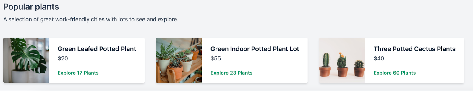
Do you see what new thing we have here? We now have a new section called “Popular plants” which shows three cards with quick information about the plants. But these are not just any other cards, these cards are getting data from an external JSON file, we just make a template for one of the cards, and then with the power of React, we display them all.
The main goal to add this section is to see how to use components in a Tailwind project. Let’s see how it goes!
1. Converting our HTML webpage to a React app
Step 1: First things first, let’s grab the entire code inside the <body> tag i.e. our div container where we give the lg:flex layout. Here’s all that code:
Step 2: Now, start a new React project and then install Tailwind by installing the following dependencies:
As the Create React App command doesn’t let you override the PostCSS config out of the box, that’s why we need to add CRACO to configure tailwind accordingly:
Step 3: Open the package.json file in your React project directory and update the scripts object so that they now look like this:
Create a new craco.config.js file in the root of the project directory adding tailwindcss and autoprefixer as PostCSS plugins:
Step 4: Create the Tailwind configuration file by running the following command:
This will create the good old tailwind.config.js file on the root of our React project (similar to the above craco.config.js).
Here, update the purge array to take all the components you (may) have so that Tailwind can easily use PurgeCSS to remove unused styles in the production builds (highly recommended for the next section of this article). Now it should look like this:
Step 5: Add Tailwind to your index.css file generated by Create React App by default. Simply replace all the code it has by default with the following:
And….we are done with setting up Tailwind. Run the project by the npm start and all the new styles will be added by Tailwind from here.
2. Getting a data source
For our plant’s collection demo webpage, we need external data or an API where all the necessary plant data resides. From there, we can then call it on our app, and with the magic of React components, we just need to render it where required.
I couldn’t find an external plant API for such information so I just made a JSON file with the following content:
As you can see, we have six values here; id, plantName, price, inStock, imageUrl and imageAlt along with their corresponding values.
Hence, we can add this new plantsCollection.js file under the /data/ directory of our project.
3. Creating the markup for plants collection
Now we want to code out the new section. Let’s go just below where our previous section ended and add a new collection container div with the project default mx-32 margin which equates to 8rem of left and right margin.
Next, we have our text elements. First a <h2> heading with text-2xl font-semibold and text-gray-700 utility classes which gives it a font-size of 1.5rem, a dark gray text color, and a font-weight of 600. Below this we have a <p> element having just a little less dark gray text color and a top margin of 0.5rem, Hence, we get the following code by now:
Now for the plant collection row we want to make it a flex display by default so that all the card elements stack side by side in a row of 3 cards. So that we get some good amount of whitespace we add md-10 class along with the usual mx-32.
Up next we need to write the actual markup of the individual cards. For that, we make a new flex container. So that we align all its children to its center in the cross-axis, the items-center utility is required.
For the card aesthetics, rounded bg-white shadow-md overflow-hidden classes are used which gives it rounded corners, a white background-color, a good amount of box-shadow and the overflow-hidden is there to clip out the necessary content to fit our element.
To make it more interactive let’s add a bit of prefix hover and transform classes. By now, here’s how our code looks like:
Inside this, we first have an image. Let’s give it a fixed width and height of 8rem with w-32 and h-32 classes. They also need to respect the aspect ratio with the object-cover class.
Towards the right of the image we have all the plant information with sufficient padding of px-6 py-4. The plant name is a h3 level heading with somewhat similar style properties we did before.
The “Explore 17 Plants” text is an anchor element with a green colored text (text-green-600), darker green (text-green-700) and a smaller font-size.
With this, we get the following output:

Now here comes the sweet part of both React and Tailwind. Right now we have just three plants in our plants collection JS file. We are not calling any external API or any other database which might, in turn, have much more data of plants. If that were the case, then can you imagine writing every plant’s details! From its card container HTML to the individual styling and values!
It becomes quite cumbersome to handle that much amount of data and when you want to have the same styles, for each item of your data, the best thing you can do is make a component out of it.
4. Using React components with Tailwind CSS
Just after the outer card container, we will be replacing the card markup with a new <PlantsCollectionCard /> component.
What we did here is a usual JavaScript thing with its map() method which loops over each of the items from the plantsCollection.js file. It renders a single <PlantCollectionCard /> passing in the plants and key prop.
But wait, we don’t have this component yet! Let’s make a new file called PlantsCollectionCard.jsx and add the following React functional component barebones code:
Of course, we need to pass on the plants prop here. Now guess what will go in the return() code. Yes, the individual card’s markup!
So all of the following code:
Converts into:
Did you see what React magic we did here? We simply replace all the hardcoded values with the dynamic values taken from plantsCollection.js file.
When you do this, you can easily see how we get all the three cards rendering in the place of <PlantsCollectionCard plants={plants} key={plants.id} />. It should look something like this:
Let’s refactor our Tailwind code in this custom component by extracting the card styles by removing all the previous utility classes used and replacing it with the card class:
Then moving all these utilities to the index css file’s @layer components directive where all the custom CSS styles live.
And there you have it! You used the power of React and Tailwind components to create a new section of our demo app.
How to optimize a Tailwind project to production?
If you want to push your local changes to a production build, Tailwind covers all the major aspects needed to squeeze out the maximum performance of your project.
One of the most important thing here is to remove unused CSS code from your production build. By default, when you use the development build, the uncompressed size of Tailwind CSS is 3566.2kB. When Gzipped, it goes down to 289kB. This might look small as it’s in kB but the development build we use is large.
Why? Because when you first install Tailwind to your project, it generates thousands of CSS classes most of which you won’t be using that often. So what to do with such classes?
Tree-shaking unused styles with PurgeCSS
Remember why we added the following code to our tailwind.config.js file?
PurgeCSS’s nature is such that it doesn’t look for classes in your HTML code, it just looks for any strings which follow a regex that matches any string which is separated by spaces, quotes, angle brackets, HTML tags, attributes, and classes:
Hence, the purge array will tree-shake any file under the src folder, files with .js, .jsx, .ts, .tsx extensions and the index.html file. All of these files and folders can have the Tailwind utilities so that only the used classes are used in the production code. You can also provide an array of full paths to all your template files in the purge option:
You can then go ahead and manually control which unused styles should be removed in the production build with the enabled option that takes in the Boolean true (for enabling purging) or false (for disabling purging).
When you pass the layers option to this object, you can change Tailwind’s default behavior of purging all the styles in the base, components, and utilities:
If you have some of the CSS animations written across your project, some of them you might not use. Let PurgeCSS take care of this. When you pass the keyframes option and set it to true, it removes the unnecessary @keyframes rules:
Disable unused core plugins
Basically, Tailwind uses a ton of default plugins for all the popular CSS styles like margin and padding. But if you want only these styles to work and don’t want other ones you can add a corePlugins section like this:
With this, all the other utilities will be disabled other than those specified under the corePlugins array.
Also, before we finish this, one important thing to note is that we should avoid writing utility classes with string concatenation:
Instead, use the complete class name as specified in the Tailwind docs.:
When you use the complete class name like this, PurgeCSS will not remove it while doing tree-shaking in the production build.
Comparing the production code
Let’s do a quick comparison of before and after purging the Tailwind code.
- Before purge: If you already have anything inside the purge array of the Tailwind config code, remove it and then run the following command which generates the production build of our project inside the src/ directory:
You will get the following output:
NOTE: If you get an error like “Cannot find module 'autoprefixer'”, make sure to follow this GitHub issue answer which essentially tells you to reinstall the latest versions of Tailwind, PostCSS, and Autoprefixer.
As you can see, we are getting a whopping 3.46MB of CSS file generated for a production-level build! This is huge for what we have built, just two sections. Imagine the size when you want to make an entire web app.
- After purge: Now let’s fix this size, we have to minify the entire code a lot. Hence, we update the purge array as:
Now, we can’t run the above command as Tailwind initiates purging only if the project environment is in production mode. For this, we use the following command:
This first sets the NODE_END to production mode and then runs the previous command.
Here’s our output now:
Do you see what I see! Yes, we managed to shrink our CSS from 3.46MB to 13.85KB!
Beautiful! You now have the power to publish this code to production.
Conclusion
In this article, you got to know what are components in a Tailwind file, how to use them to maximize the developer productivity in your project, and how to extract them to a separate file.
Later, we created our components with the power of React’s nature in our plant’s demo. Finally, we learned all about production tips and took an exclusive dive into the Tailwind configuration file. Then we make our demo project production-ready!
What’s next?
In the next part of the Tailwind CSS from Zero to Hero series...pssst..wait! Is there a next part too?
Well, I feel there are still a few topics left like adding dark mode, adding your design system, functions, and directives, etc. These all may be covered in an exclusive ‘bonus’ part.
So, are you ready for one Tailwind learning? See you there!


